
An independently produced editorial shaped through concept development, wardrobe styling, beauty direction and shot-list planning, then published by The Prestige Magazine.
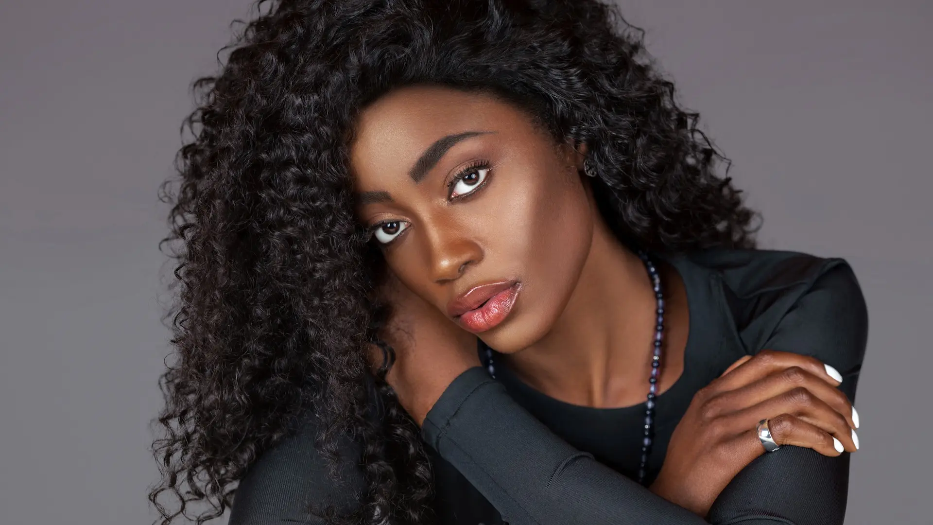
The Spring Is in the Air fashion editorial began as an independent production in Germany. It was not commissioned by a magazine or fashion brand. Instead, the team developed a complete seasonal story first, then created a polished editorial with enough range and continuity to stand on its own. The finished work was later published by The Prestige Magazine.
The creative challenge was to connect tailoring, statement jewelry, transitional outerwear and activewear within one visual world. The answer was a structured progression: controlled studio portraits first, softer color and ornament next, and a more energetic botanical setting at the end. This case study shows how creative direction for fashion photography can turn diverse wardrobe credits into a clear story rather than a disconnected set of looks.
Project At A Glance
- Format: Independently produced fashion editorial
- Location: Germany
- Creative direction: Sophia Lenore
- Photography: Phil Halfmann
- Objective: Build one cohesive seasonal narrative across tailoring, beauty, jewelry, outerwear and activewear
- Deliverables: Editorial stills, beauty details, full looks and behind-the-scenes video
- Publication: Later published by The Prestige Magazine
Production Scope And Planned Deliverables
The production was organized around three shot lists covering tailoring, dresses and transitional activewear. Together, they mapped 13 planned styling and coverage variations. These included full-length fashion images, three-quarter compositions, seated portraits, beauty close-ups, jewelry details and wider editorial frames.
- Production format: Independently produced fashion editorial
- Shot lists: Three structured photography plans
- Planned variations: 13 wardrobe, beauty and accessory setups
- Wardrobe contributors: MADS NORGAARD, UNIQLO, Esprit and CASALL
- Jewelry contributors: KONPLOTT and Gabriele Iazzetta
- Beauty products: L’Oréal hair products and Charlotte Tilbury makeup
- Content formats: Editorial stills, full looks, beauty portraits, accessory details and behind-the-scenes video
- Publication outcome: The completed editorial was later published by The Prestige Magazine
The contributors supplied products for the independently produced story; they were not commissioning clients. This distinction is important because the production was developed without a brand or magazine brief. The team had to establish the concept, visual standards and required image coverage internally before approaching publication.
The Creative Challenge Behind The Spring Is in the Air Fashion Editorial
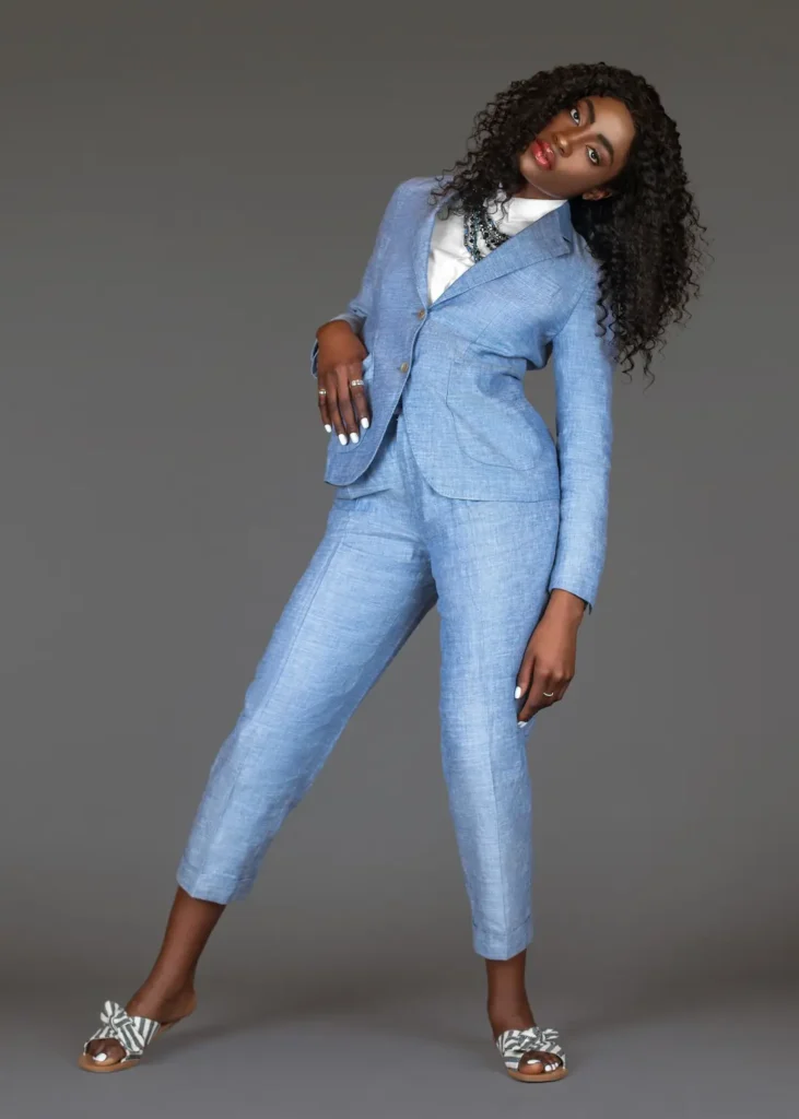
The wardrobe moved across distinct visual codes. Neutral tailoring communicated control. Blue suiting and a shirt dress softened the story. Dark outerwear introduced weight, while performance pieces called for movement and freshness. Without a strong plan, those elements could have looked like separate shoots.
The concept therefore needed a flexible system. It had to preserve continuity in light, beauty and posture while allowing each wardrobe chapter to change the pace. The team used a shared visual mood board to align on tone before production. Three shot lists then translated that direction into practical coverage.
Shot Lists Built Range Into Every Look
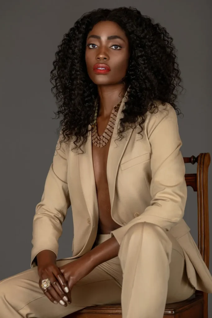
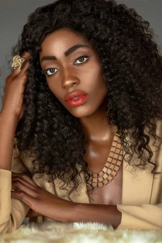
Pre-production defined the required visual range before the camera came out. Each wardrobe chapter included a deliberate mix of medium portraits, headshots, three-quarter compositions and full looks. Seated and standing variations added rhythm. Beauty details created useful close crops, while wider frames protected space for editorial layouts and digital use.
This approach did more than collect options. It made the edit coherent. Every look contributed a specific function to the story, and the team could move efficiently between coverage types. For brands planning a similar production, this is the same principle behind a strong fashion shoot plan that supports multiple content needs.
Phil Halfmann’s Photographic Contribution
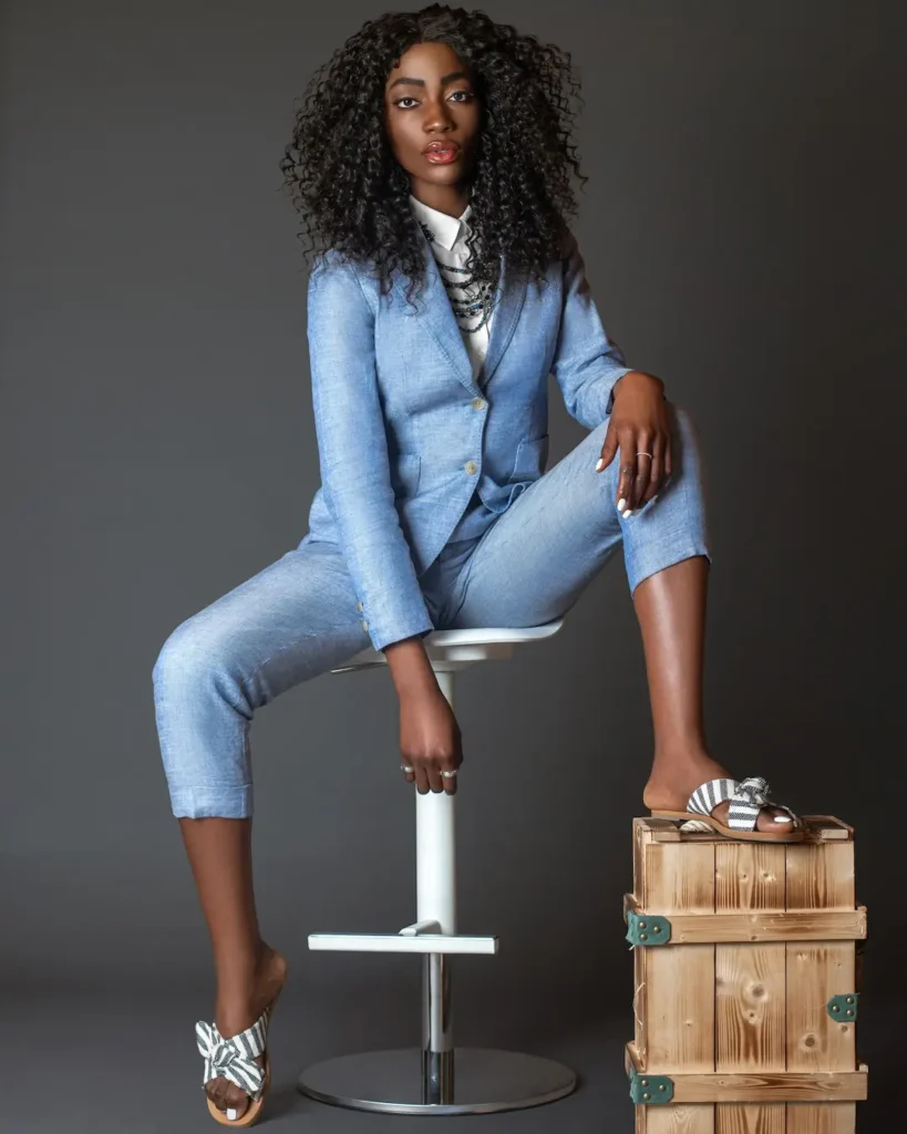
While Sophia Lenore led the editorial’s creative direction, wardrobe styling and beauty direction, Phil Halfmann translated that concept into a consistent photographic language. His role was to ensure that the changing garments, accessories and sets still felt like chapters of the same Spring Is in the Air fashion editorial.
Phil used controlled lighting and a restrained studio background to establish continuity across the opening tailoring and beauty portraits. He then adjusted the framing, camera position and visual energy to match each wardrobe chapter. Close beauty images emphasized makeup, hair and statement jewelry. Medium and full-length compositions documented the styling, while wider frames created space for editorial layouts and digital crops.
As the story moved into outerwear and activewear, the photography became more dynamic. Lower camera positions strengthened the coat silhouettes, while the botanical set introduced greater depth, color and movement. Despite these changes, consistent skin tones, lighting quality and portrait treatment kept the final edit visually connected.
This photographic approach turned the shot lists into a practical image system. Rather than producing a series of isolated fashion portraits, the photography delivered beauty details, editorial hero images and complete wardrobe views that could work together as one publishable story.
Styling Connected Contrast And Continuity
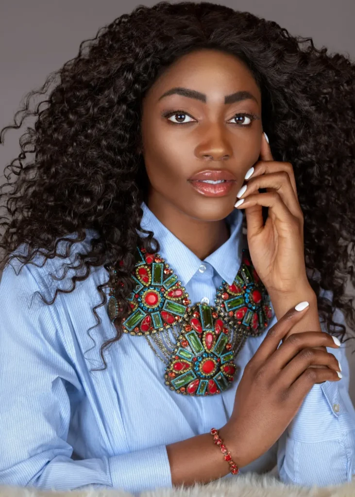
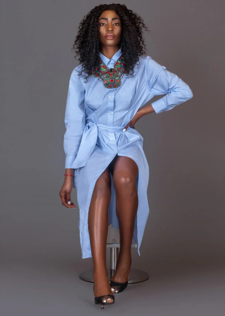
The Spring Is in the Air fashion editorial did not rely on one repeated silhouette. Instead, wardrobe styling created continuity through color relationships and controlled contrast. Sand, camel and grey formed the foundation. Blue became the bridge between tailoring, dresses, coats and performance clothing. Red and green jewelry then provided concentrated accents without taking over the full palette.
Beauty direction supported the same logic. Defined curls, luminous skin and consistent grooming held the story together while lip color and eye intensity shifted between chapters. Statement jewelry received dedicated close coverage, so accessories remained visible without forcing every full-length image to carry the same visual weight.
Transitional Outerwear Made The Season Credible
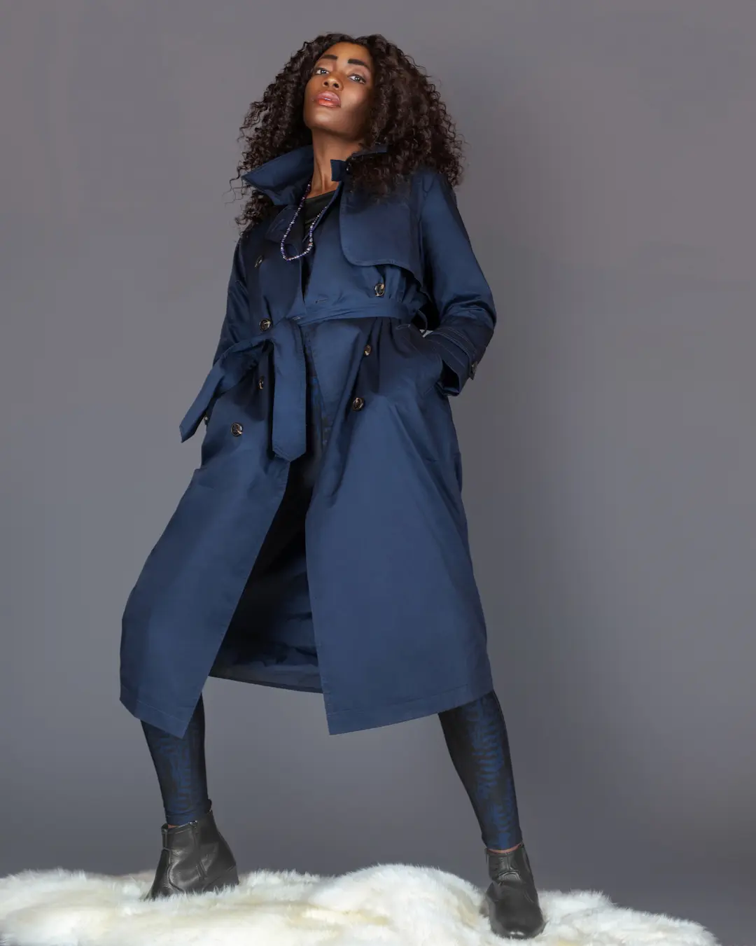
A spring story produced in Germany needs more than visual lightness. It also needs to acknowledge transition. The darker coat-and-legging look gave the editorial a practical counterpoint to the blue tailoring. A low camera position strengthened the silhouette and changed the visual tempo before the botanical sequence.
Activewear Introduced Movement And Growth
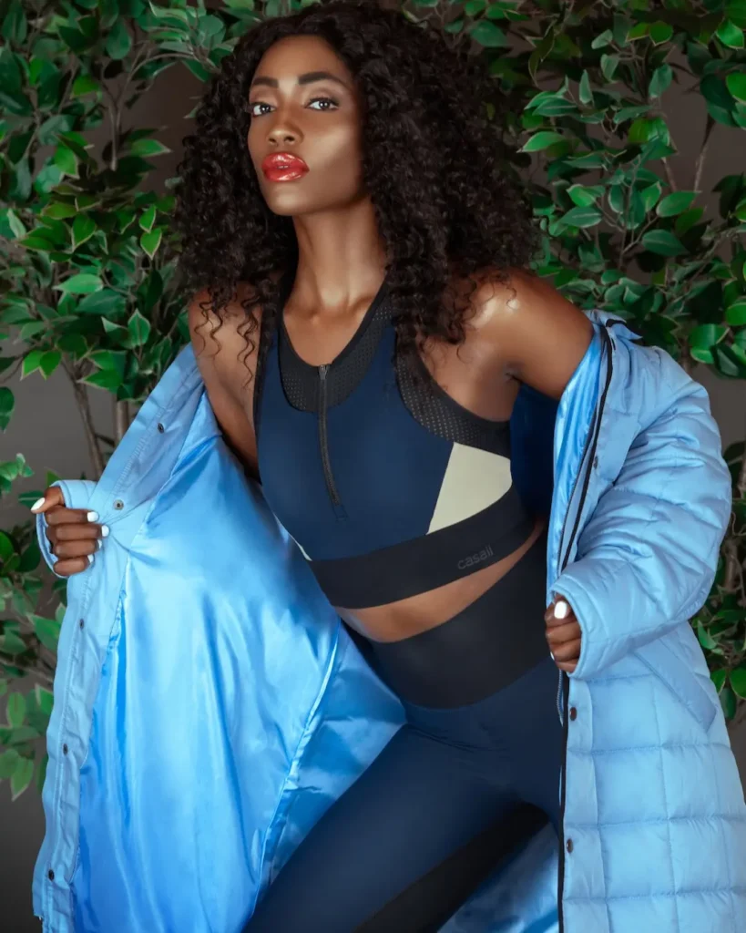
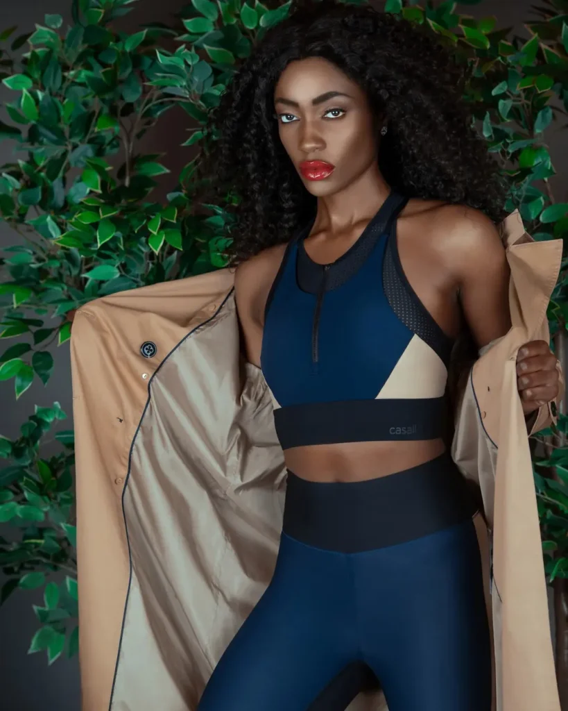
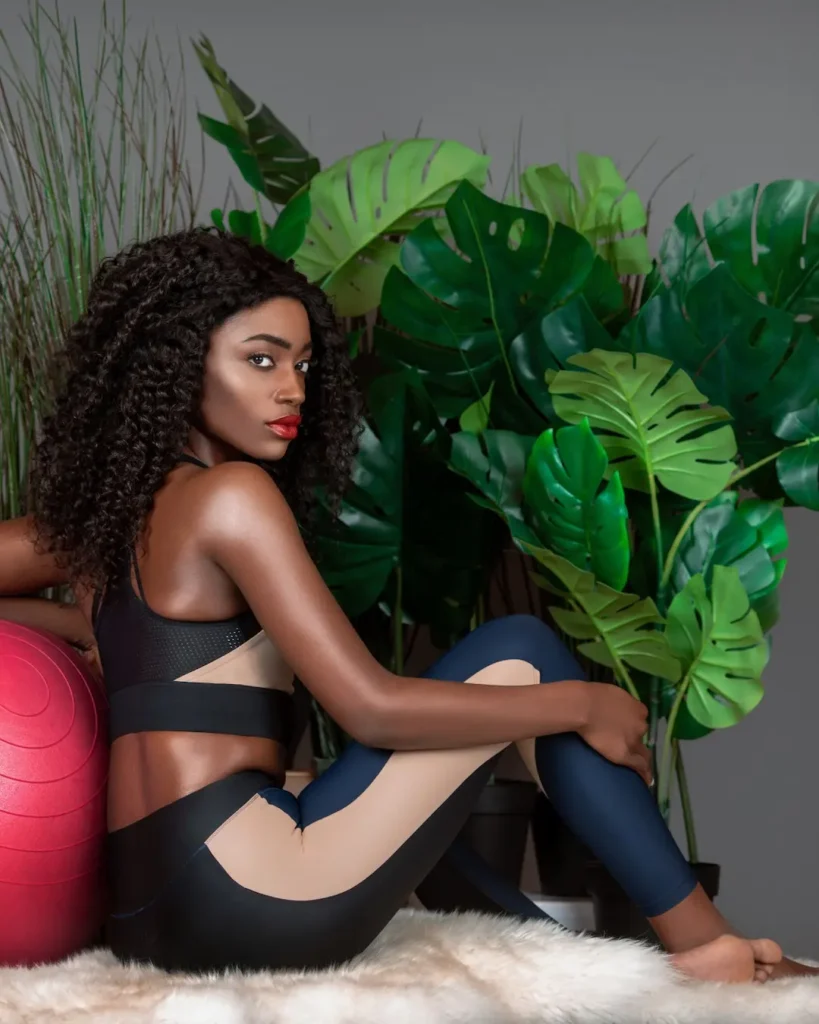
The final fashion chapter moved away from the neutral studio background and into a dense botanical set. This was the clearest expression of the seasonal theme. Foliage introduced growth and energy, while fitted CASALL pieces changed the model’s posture and brought a more athletic line to the frame.
Layering kept this chapter connected to the earlier wardrobe. A blue coat extended the established color bridge. A camel coat returned to the opening neutrals. As a result, the botanical images felt like a progression rather than a separate activewear story. This is a practical example of fashion storytelling through photography: each visual decision advances the narrative while maintaining a recognizable world.
The Outcome: An Editorial With Planned Visual Range
The result was a complete fashion story with enough variation for a magazine feature, portfolio presentation and supporting digital content. The images move through clear chapters, yet recurring colors, controlled lighting, consistent beauty and repeated compositional choices keep them connected. The completed story was subsequently selected for publication by The Prestige Magazine, providing an external editorial placement for the independently produced work.
Just as important, the production shows what strong fashion editorial creative direction can do before and during a shoot. It can align a team, protect the central idea, make a varied wardrobe feel intentional and create a more disciplined final edit. A related example is the multi-brand fashion shoot creative direction case study, which explores how one production can serve several contributors without losing cohesion.
What Fashion And Beauty Brands Can Apply From This Editorial
Although the project was an independent editorial, its production structure offers practical lessons for commercial fashion and beauty campaigns. The same planning principles can help brands create more coherent content while increasing the number of useful assets produced during one shoot.
1. Define Image Coverage Before Production
A mood board establishes the visual direction, but it does not specify every required deliverable. The three shot lists translated the concept into defined coverage, including hero images, full looks, beauty details and accessory close-ups. For a commercial campaign, the same process can also account for website banners, paid advertisements, social media crops, press assets and ecommerce requirements.
2. Use Recurring Visual Elements To Connect Different Products
The wardrobe moved from neutral tailoring to blue suiting, dark outerwear and activewear. Recurring colors, consistent beauty treatment and controlled lighting prevented these categories from feeling unrelated. Brands can use the same principle when a campaign must present several products, collections or customer use cases within one recognizable visual world.
3. Plan For Both Storytelling And Product Visibility
Editorial impact and commercial clarity do not have to compete. Wider compositions built atmosphere, while full-length images documented the wardrobe and close portraits highlighted beauty and jewelry. Planning these coverage levels in advance gives marketing teams more flexibility without asking one photograph to perform every function.
4. Build Format Flexibility Into The Photography
Variation in framing created assets suitable for editorial layouts, portfolio presentation and supporting digital content. For brands, that flexibility should be planned around specific channels. Horizontal space may be needed for website headlines, while vertical and square compositions support social platforms and paid media placements.
5. Treat Every Look As Part Of One Content System
Each look should contribute something distinct without breaking the campaign’s central idea. In the Spring Is in the Air fashion editorial, tailoring established control, outerwear introduced seasonal transition and activewear added movement and growth. This progression shows how varied products can be organized as connected chapters rather than photographed as isolated deliverables.
Behind The Scenes
The behind-the-scenes film shows the studio workflow, styling changes and collaborative production process behind the final images.
Credits
- Photographer: Phil Halfmann
- Creative director: Sophia Lenore
- Hair and makeup: Sophia Lenore
- Wardrobe stylist: Sophia Lenore
- Model: Ruth Bambi
- Retoucher: Stas Ponomarenko
- Publication: The Prestige Magazine
- Hair products: L’Oréal
- Makeup: Charlotte Tilbury
- Jewelry: Gabriele Iazzetta and KONPLOTT
- Wardrobe: UNIQLO, Esprit, MADS NORGAARD and CASALL
Planning A Fashion Story That Needs To Work As One Visual System?
Explore more case studies, or get in touch to discuss creative direction, pre-production and fashion photography.