
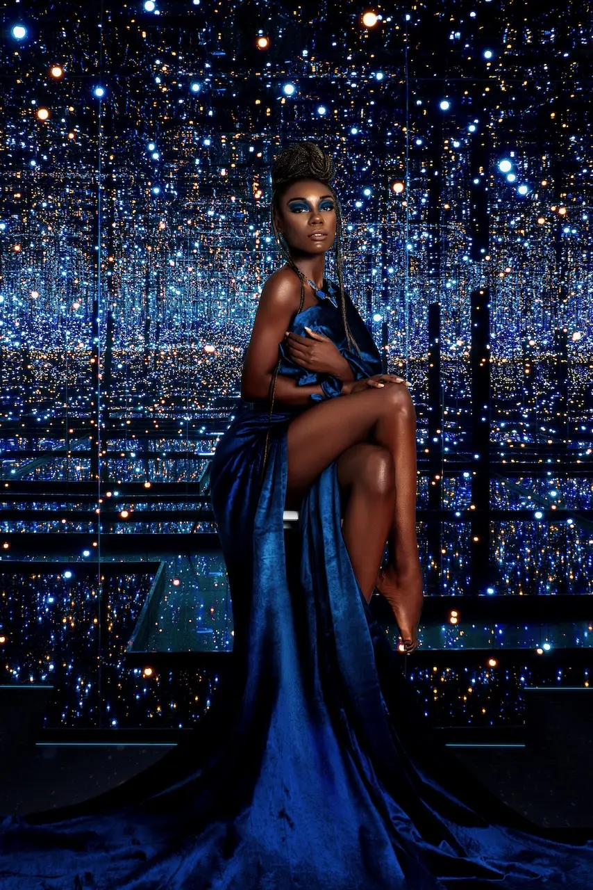
Commissioned by The Prestige Magazine, Colour Me Beautiful was a music-inspired beauty editorial built around saturated color, reflective light and a strong central character. A shared mood board and two shot lists translated the initial reference point into eleven planned setups, while coordinated styling, beauty and photographic direction kept two contrasting looks inside one recognizable visual world.
Project at a Glance
| Commissioning publication | The Prestige Magazine |
|---|---|
| Editorial | Colour Me Beautiful |
| Production date | August 29, 2022 |
| Format | Studio fashion and beauty editorial |
| Pre-production | Pinterest mood board and two shot lists covering eleven specified setups |
| Delivered library | 34 finished photographs |
| Usage clearance | Model release on file |
| Published outcome | Editorial feature on The Prestige Magazine |
| Phil Halfmann’s contribution | Photography, lighting execution, camera-angle planning, on-set interpretation and delivery of the finished image set |
The Creative Challenge: Reference Without Replication
The editorial took inspiration from the atmosphere surrounding Kendrick Lamar and SZA’s All the Stars and the wider visual world associated with Black Panther. The production challenge was to acknowledge that source of inspiration without treating a recognizable cultural reference as a ready-made photograph.
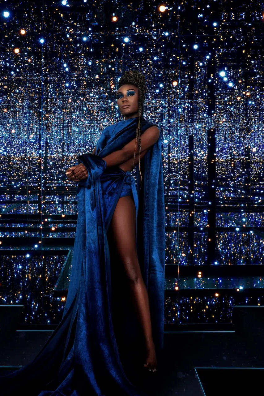
The team therefore worked with transferable visual principles: a celestial environment, luminous color, sculptural styling, ceremonial detail and a subject presented with confidence and presence. Those principles created a useful creative framework while leaving room for an original photographic interpretation.
This distinction matters in campaign concept development. References can establish emotional territory, but production still needs its own decisions about color, casting, styling, composition, lighting and sequence.
Turning the Mood Board into an Executable Beauty Editorial
The mood board communicated atmosphere. The two shot lists made that atmosphere producible. Together, they specified full-length, three-quarter, seated, back-facing and close beauty compositions. Most frames were planned vertically, with a selected horizontal close-up adding layout flexibility. A consistent two-light arrangement from the left and right provided the technical base across both looks.
That preparation created boundaries without making the shoot mechanical. Camera height, crop and pose family were determined in advance, but expression, hand placement, fabric movement and the precise relationship between subject and environment could still be refined on set. This is the practical role of a photography shot list: it protects the required coverage while preserving space for better ideas during production.
Two Color Worlds, One Visual Identity
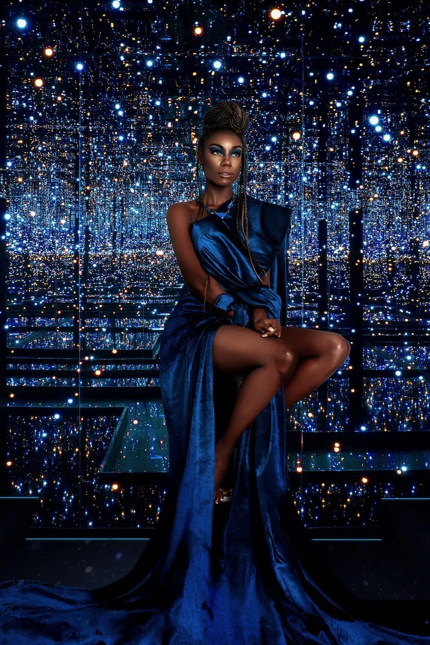
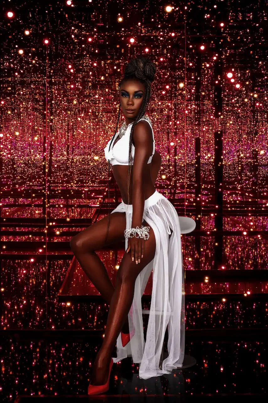
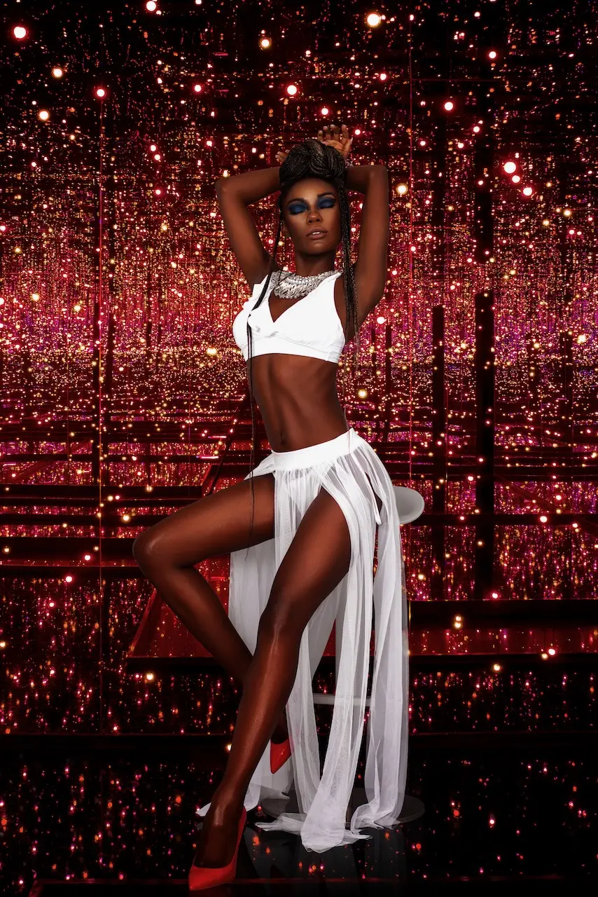
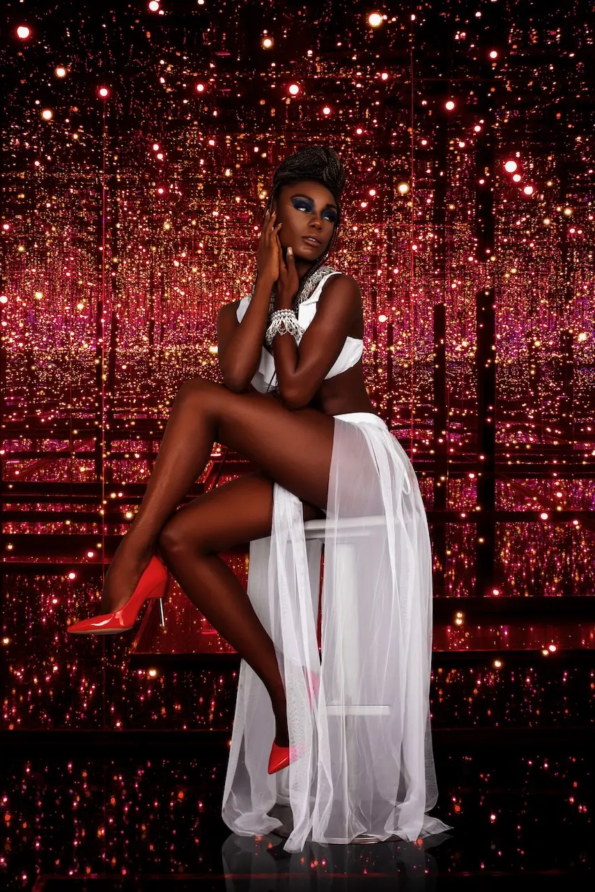
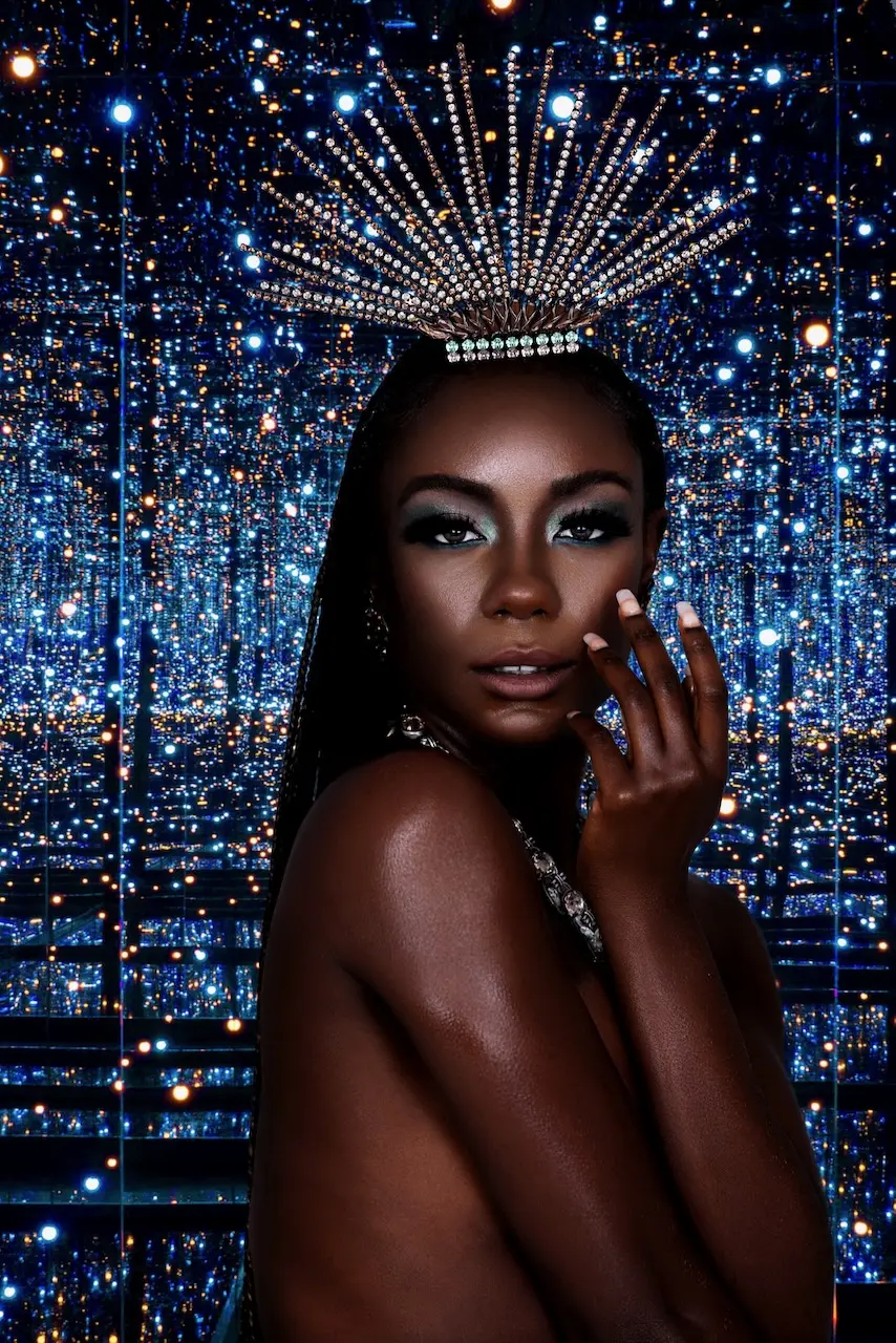
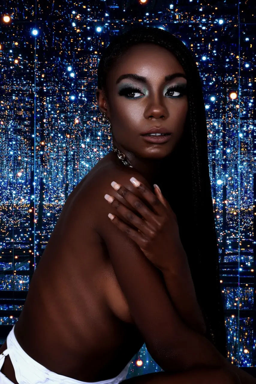
The finished story moves between cobalt blue and saturated red. The first look pairs a fluid blue garment with a cool, star-like environment. The second uses white styling and red heels against a warmer field of reflected light. The contrast is immediate, yet the production remains cohesive because the underlying visual rules stay stable.
Both worlds use centered compositions, a strong vertical axis, controlled two-sided lighting and repeated reflective texture. The model remains the visual anchor even when the background becomes intense. As a result, color changes the emotional register without making the photographs feel as if they belong to separate editorials.
From Fashion Silhouette to Beauty Detail
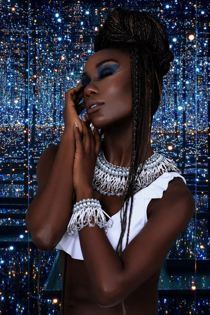
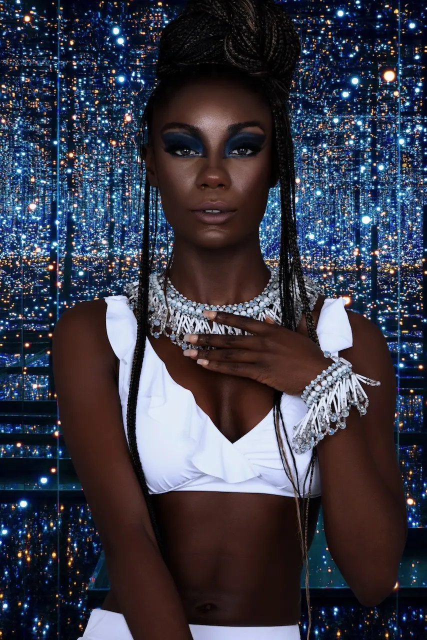
The image set was not built around one repeated distance. Full-length frames established wardrobe and silhouette. Seated variations changed the geometry and allowed fabric, legs and accessories to organize the composition. Tighter portraits then shifted attention toward makeup, hair, skin and jewelry.
This range gave the publication a sequence rather than a gallery of near-duplicates. It also demonstrates a broader lesson for beauty campaign photography: visual consistency should not be confused with identical framing. A useful image library needs controlled variation across distance, gesture, crop and intensity.
Beauty, Hair, Wardrobe and Light as One System
Sophia Lenore led the creative direction, wardrobe styling and hair styling. Aida Greenidge-Gopie created the makeup, and Ann-neika carried the story across fashion-led and beauty-led frames. Charlotte Tilbury makeup, L’Oréal hair products and USLU Airlines nail products supported the finished beauty treatment.
The photography had to hold all of those elements together. Deep skin tones, white fabric, metallic jewelry, blue makeup and highly reflective backgrounds each respond differently to light. The left-and-right lighting structure therefore needed to preserve facial dimension and garment detail without allowing the set to overpower the subject.
The Published Outcome
The production delivered 34 finished photographs and became a published feature titled “Color Me Beautiful: Homage to Kendrick Lamar’s ‘All the Stars’” on The Prestige Magazine. The final library provided enough visual range to move from full-length fashion imagery to intimate beauty portraiture while maintaining one coherent editorial identity.
No audience, conversion or revenue data was available for this case study. Accordingly, the page does not claim commercial performance. The verified outcomes are the commissioned production, the 34-image delivery, the signed model release and the published editorial.
What Fashion and Beauty Teams Can Learn
- Extract principles from references. Use inspiration to define atmosphere, material, energy and color—not to prescribe a copy.
- Turn mood into production decisions. Shot lists should define crop, viewpoint, lighting and priority coverage before the team reaches set.
- Create contrast inside a stable system. A dramatic palette change can remain cohesive when composition, lighting and subject hierarchy stay consistent.
- Plan visual range deliberately. Full-length, seated, medium and close beauty frames give an editorial or campaign room to breathe.
- Coordinate every department around one idea. Hair, makeup, wardrobe, posing and lighting should reinforce the same visual logic.
- Claim only what the evidence supports. Publication and asset delivery are valid outcomes; they are not substitutes for performance data.
For another example of how mood-board direction, lighting and styling choices can become a cohesive published story, explore the Clean & Serene beauty editorial case study.
Production Credits
- Commissioned by: The Prestige Magazine
- Photographer: Phil Halfmann
- Creative Director: Sophia Lenore
- Wardrobe Stylist: Sophia Lenore
- Hair Stylist: Sophia Lenore
- Makeup Artist: Aida Greenidge-Gopie
- Model: Ann-neika
- Makeup: Charlotte Tilbury
- Hair products: L’Oréal
- Nail products: USLU Airlines
Planning a Fashion or Beauty Campaign?
A strong visual idea becomes more valuable when it is translated into clear shot requirements, adaptable formats and a purposeful image library. Book a Free Visual Audit to identify the visual gaps, production priorities and channel requirements your next campaign should address.