
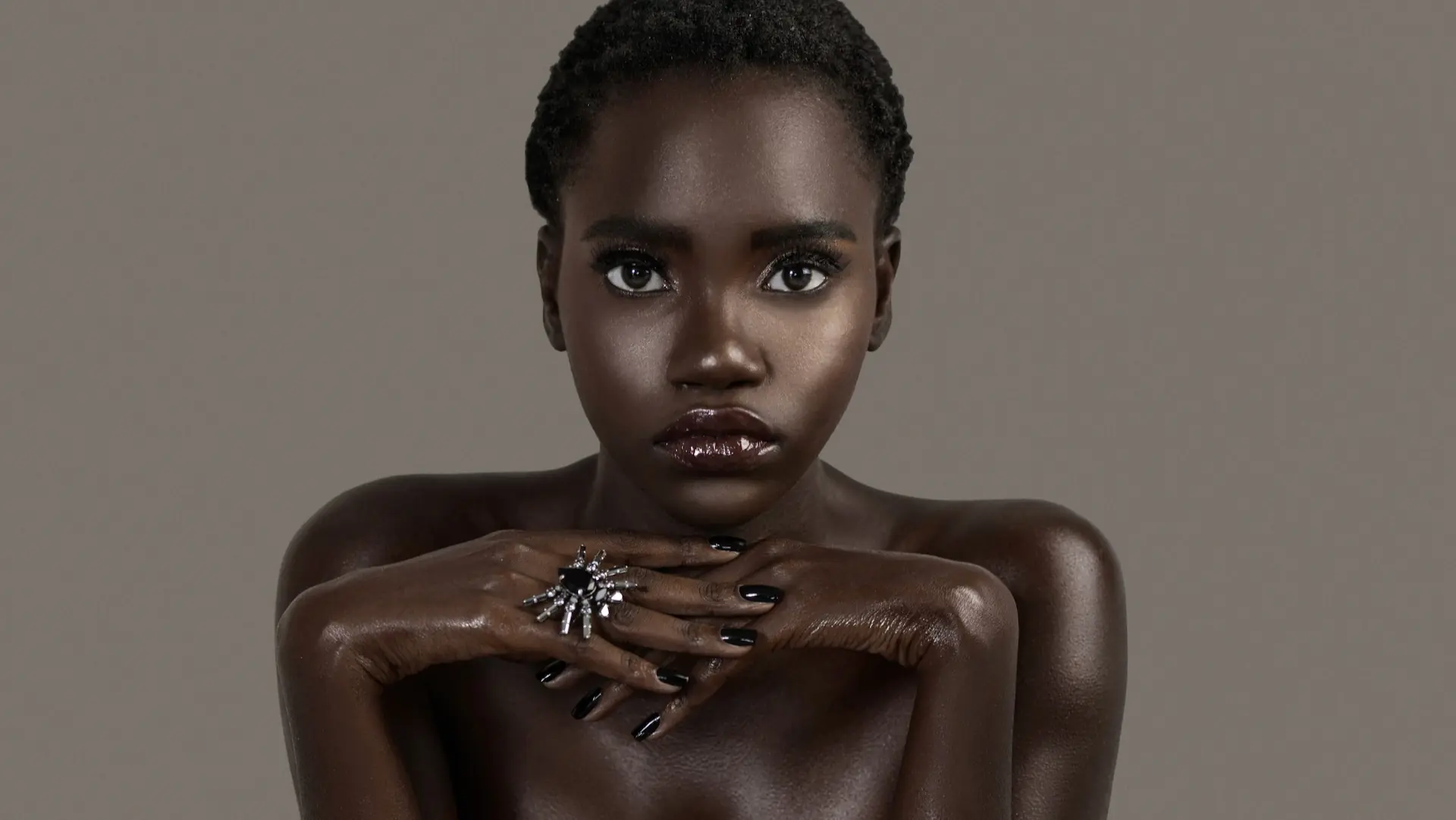
Commissioned by The Prestige Magazine, “Clean & Serene” used beauty editorial creative direction to translate an abstract idea, tranquility with presence, into a cohesive studio story. A defined mood board, look-specific shot lists, controlled lighting, expressive posing and coordinated beauty, hair, wardrobe and jewelry decisions gave the production variety without losing its visual identity.
Project at a Glance
- Commissioning publication: The Prestige Magazine
- Editorial: Clean & Serene
- Production date: July 3, 2020
- Format: Studio beauty and fashion editorial with still photography and behind-the-scenes video
- Pre-production: Pinterest mood board plus three look-specific shot lists
- Published outcome: A nine-look editorial story on The Prestige Magazine
- Phil Halfmann’s contribution: Photography, photographic interpretation of the concept, lighting execution, camera-angle planning and delivery of the finished image set
The Creative Challenge: Make Serenity Visually Compelling
“Clean” and “serene” can easily become visually passive. Therefore, the challenge was not simply to make restrained portraits. The team needed to express calm without removing tension, individuality or editorial impact. The finished photographs had to feel polished enough for publication while giving the model room to project confidence, vulnerability, playfulness and authority.
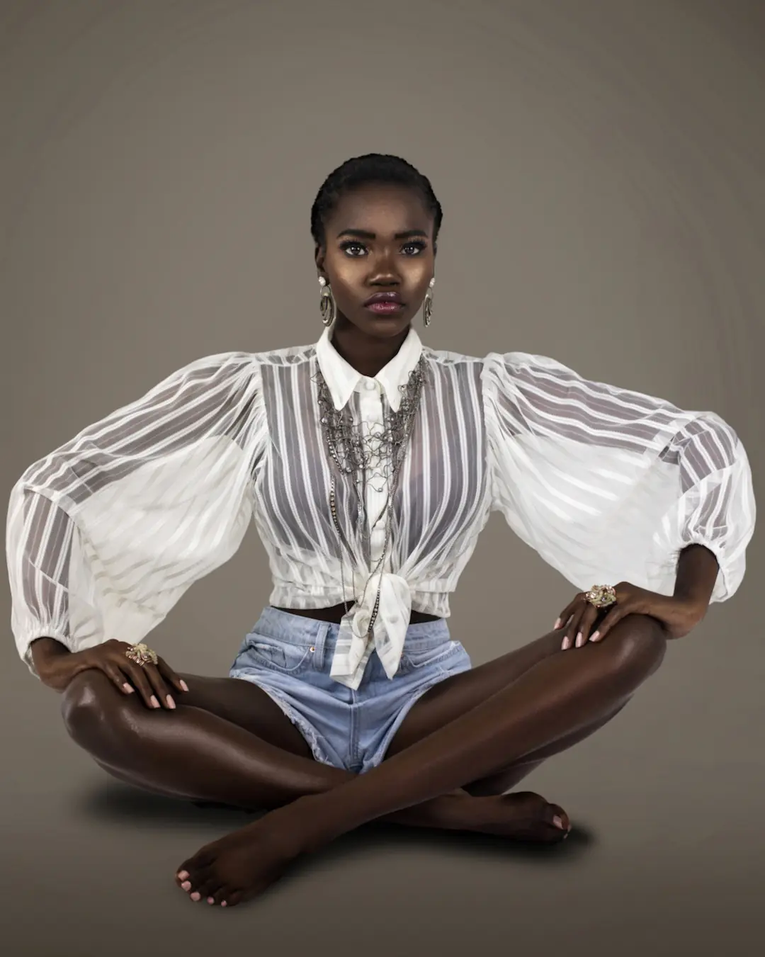
That distinction shaped the production. Serenity became a controlled visual environment rather than a single facial expression. Clean backgrounds, deliberate lighting and uncluttered compositions created continuity. Meanwhile, makeup color, jewelry scale, hair changes, fabric texture and shifts in body language supplied contrast.
Consequently, the story did not depend on one repeated aesthetic. It developed a visual rhythm in which restraint acted as the foundation and stronger creative elements became purposeful accents.
From Beauty Campaign Mood Board to Executable Decisions
The Pinterest mood board established the emotional territory: luminous skin, direct portraiture, clean surfaces, sculptural gestures and a balance between softness and strength. However, references alone do not make a production executable. They must be converted into decisions about framing, lighting, movement, props and sequence.
That conversion happened through three look-specific shot lists. Together, they specified vertical and horizontal layouts, level and low camera angles, one- to three-light arrangements, ring-flash combinations, light direction and model actions. Some frames called for symmetrical, centered presence. Others used a lower viewpoint, asymmetry or movement to change the energy without abandoning the editorial world.
This is the practical value of campaign concept development: the concept becomes a production framework rather than a collection of attractive references. A similar planning principle shaped the Trippen shoes pre-production case study, where the mood board and shot architecture also reduced ambiguity before the shoot.
How Beauty Editorial Creative Direction Shaped the Photography
Phil Halfmann’s role extended beyond recording the completed styling. The photographic contribution was to translate the creative direction into light, viewpoint, crop, timing and visual continuity. Each of those choices affected whether the editorial would feel like one story or several unrelated tests.
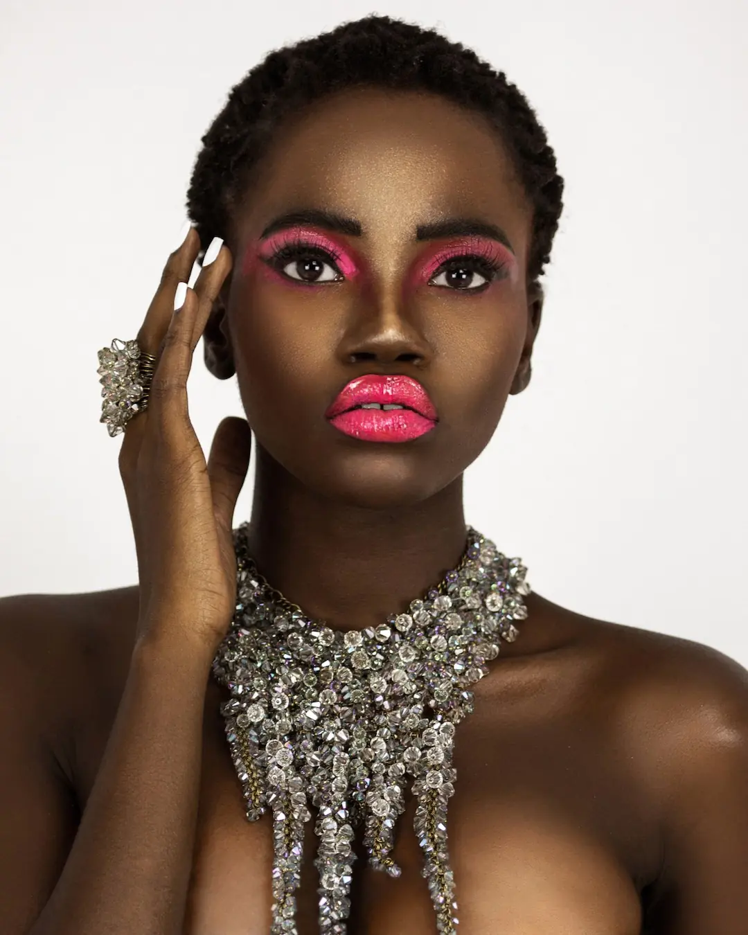
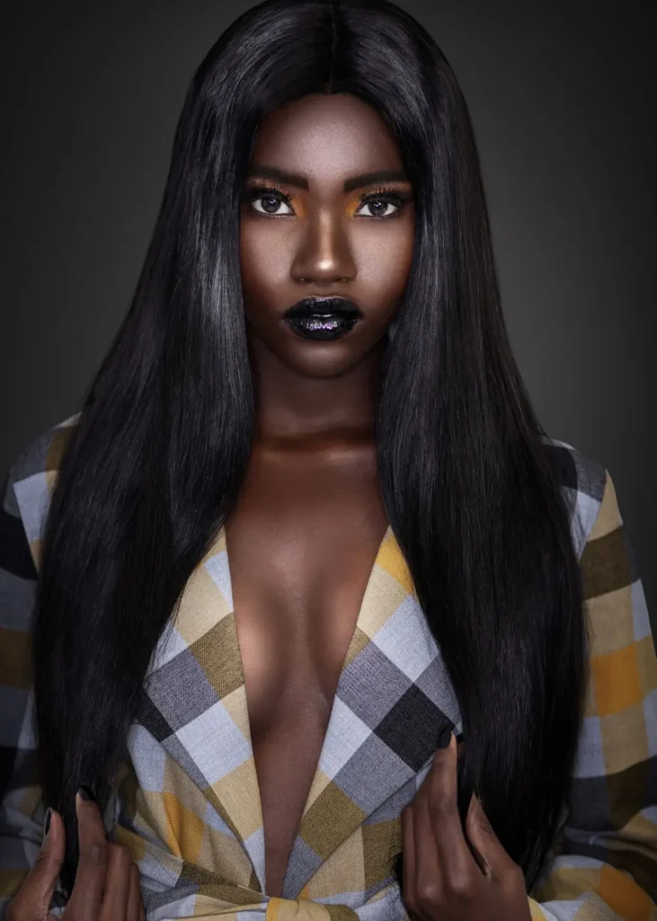
First, the lighting needed to preserve detail across deep skin tones, glossy makeup, dark hair, white wardrobe and reflective jewelry. Therefore, exposure and light direction had to reveal skin texture and facial structure without flattening the model or allowing highlights to dominate.
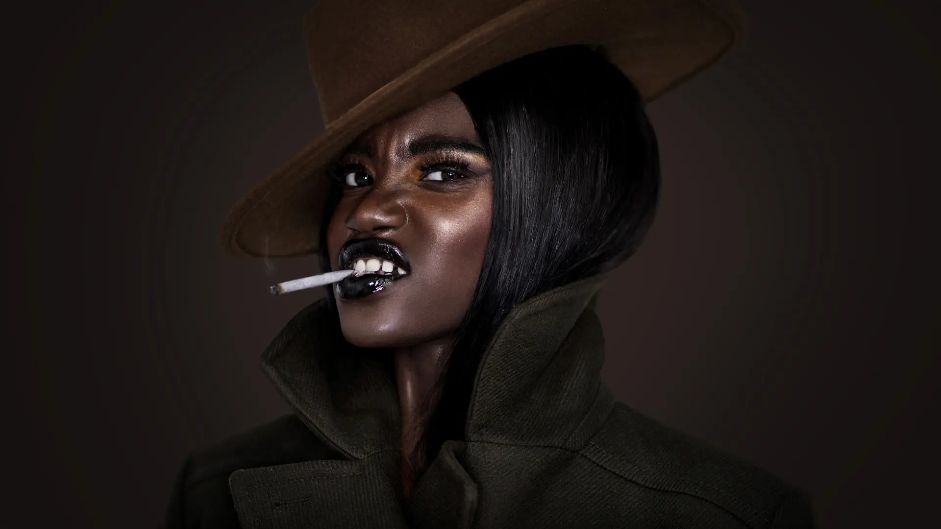
Second, camera height became a storytelling tool. Level beauty portraits created intimacy and directness. In contrast, lower angles added stature and made the body lines, hair and accessories feel more sculptural. Horizontal compositions then introduced breathing room and changed the editorial pace between tighter vertical frames.
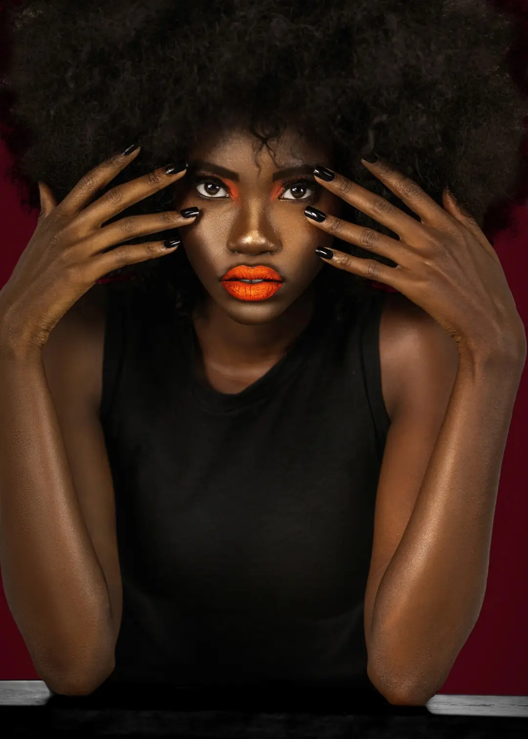
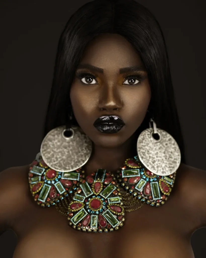
Finally, posing direction connected the visual elements. Hands framed the face, activated jewelry and created graphic lines. Profile and over-the-shoulder positions emphasized silhouette. More animated expressions brought contrast, yet the lighting and tonal treatment kept those frames inside the same visual world.
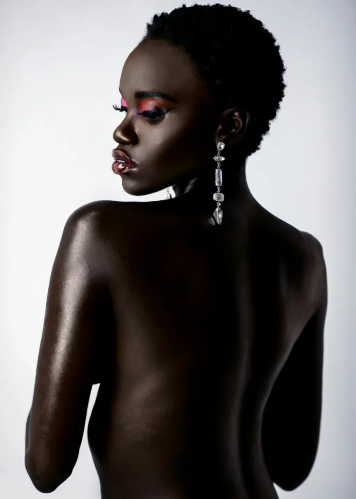
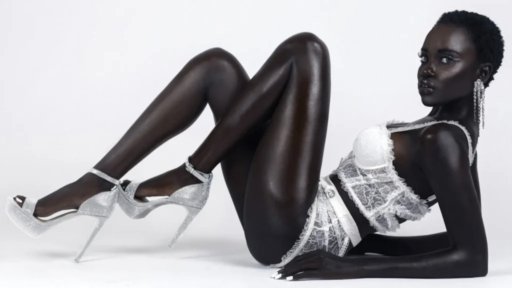
Building Variety Without Breaking the Story
The production moved through several creative registers: vivid beauty color, graphic jewelry, luminous skin, sheer white styling, natural hair, long INDIQUE HAIR, neutral fabric and darker fashion-led styling. Ordinarily, that degree of variation can fragment an editorial. Here, consistency came from repeated visual principles rather than identical looks.
Across the set, the compositions remained intentional, the backgrounds stayed controlled and the model’s gaze carried the story. Jewelry by KONPLOTT was treated as a structural element rather than incidental decoration. Likewise, the hair changes altered silhouette and attitude, but they did not replace the underlying character of the editorial.
This balance matters in beauty editorial creative direction. Cohesion does not mean making every frame look the same. Instead, it means defining which elements may change and which visual rules must remain stable.
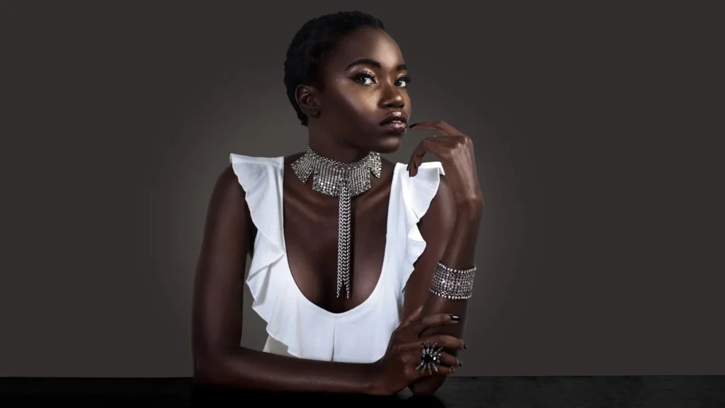
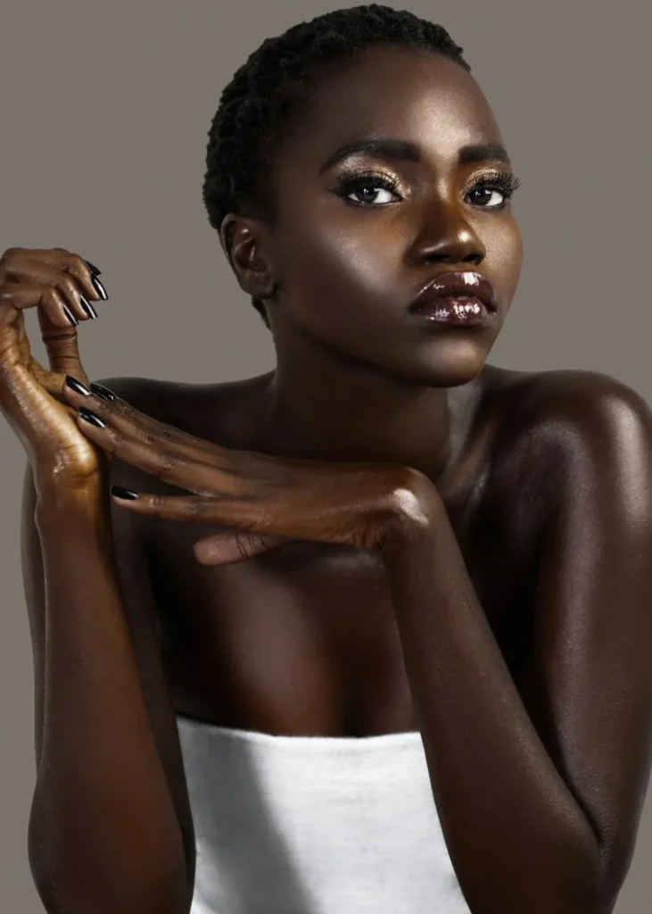
Beauty, Hair, Wardrobe and Retouching as One System
Beauty editorials are built through handoffs. Creative direction establishes the visual intent. Hair and makeup translate it onto the model. Wardrobe and jewelry create shape, texture and contrast. Photography interprets those decisions through light and composition. Retouching must then refine the files without erasing the qualities the production worked to create.
Sophia Lenore led the creative direction, hair and makeup, and wardrobe styling, while Taina Norell and Kathy Esquivel supported the beauty execution. KONPLOTT jewelry added both delicate and oversized reflective forms. INDIQUE HAIR enabled a marked silhouette change for the later frames. Finally, Stas Ponomarenko’s retouching maintained polish across different lighting, makeup and styling treatments.
The result demonstrates why a strong editorial depends on coordinated departments rather than isolated individual contributions. That same principle appears at a larger scale in the Zalando Beauty case study, where range and consistency also had to coexist within one production language.
Behind the Scenes: From Shot List to Finished Frame
The behind-the-scenes film reveals the collaborative work hidden by the finished photographs: beauty adjustments, wardrobe preparation, lighting changes, posing direction and the repeated refinement of small details. It is useful evidence because it shows that the apparent simplicity of the final imagery was produced through preparation and active decision-making.
Watch the Clean & Serene behind-the-scenes video on YouTube.
The Published Outcome
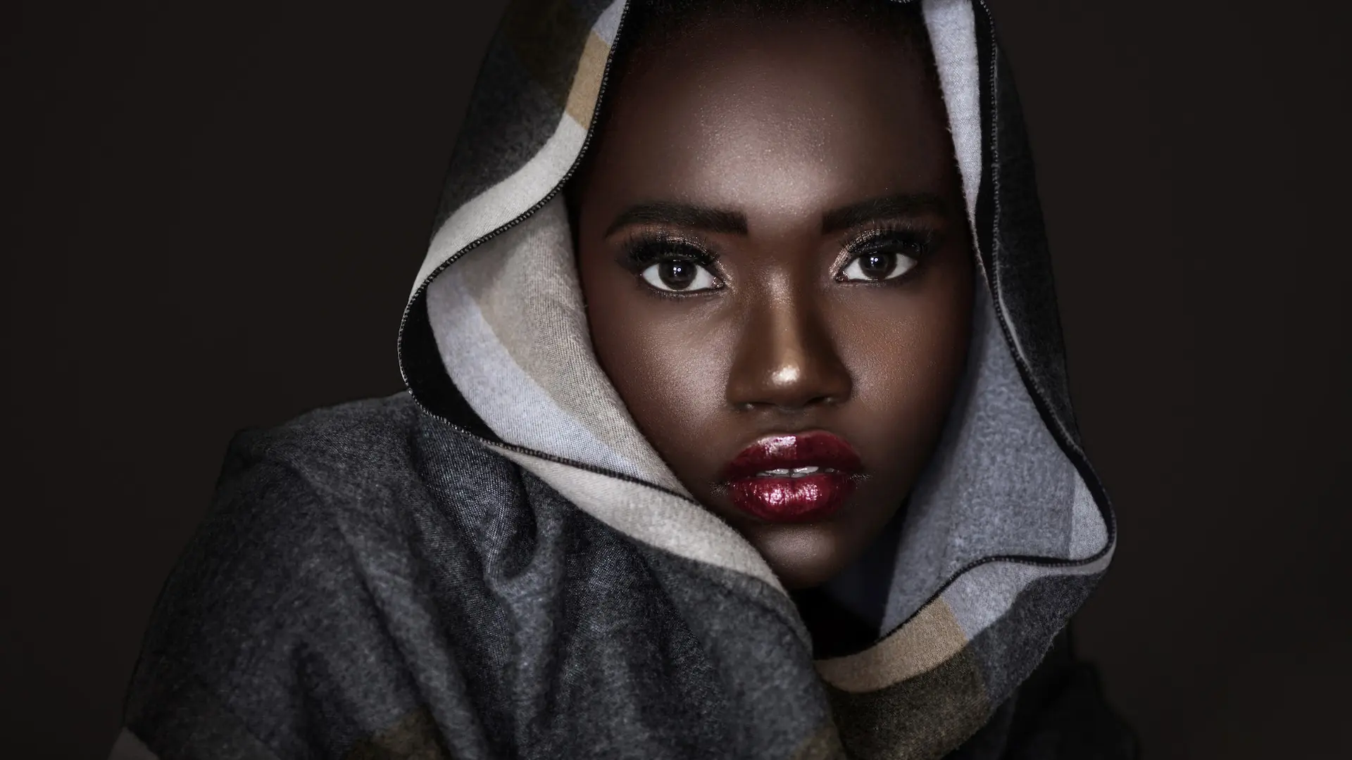
The completed production became a nine-look editorial for The Prestige Magazine. The published sequence emphasized modern beauty, self-expression, effortless elegance and quiet power.
The meaningful outcome is not simply that individual images were published. Instead, the team delivered enough range to support an extended editorial while preserving a recognizable concept. Close beauty frames, horizontal compositions, full-body fashion images and expressive variations gave the publication editorial pacing rather than visual repetition.
No audience, conversion or revenue data was available for this case study. Therefore, it does not claim quantified commercial performance. The verifiable results are the completed image library, behind-the-scenes film and published editorial.
What Beauty Brands and Editorial Teams Can Learn
- Translate mood into production variables. Define camera angle, crop, lighting, expression, movement and props instead of relying on references alone.
- Create contrast inside a stable system. Color, hair and styling can change substantially when composition and tonal logic provide continuity.
- Plan both vertical and horizontal coverage. Orientation should be decided before production so the final library supports editorial layouts and digital placements.
- Use accessories compositionally. Jewelry, hands and fabric should shape the frame rather than appear as afterthoughts.
- Protect skin and product detail. Lighting and retouching must work together when dark skin, glossy makeup and reflective jewelry share the image.
- Document the process. Behind-the-scenes content adds context, demonstrates production value and extends the usefulness of the shoot.
For commercial productions, the next step is to map this creative logic to channel and business requirements. The multi-channel beauty product photography case study shows how one visual system can support website, educational and promotional uses. The Colour Me Beautiful editorial case study offers a complementary example of maintaining cohesion across two dramatically different color worlds.
Production Credits
- Photographer: Phil Halfmann
- Creative Director: Sophia Lenore
- Lead Hair & Makeup: Sophia Lenore
- Lead Wardrobe Stylist: Sophia Lenore
- Hair & Makeup: Taina Norell
- Hair & Makeup Assistant: Kathy Esquivel
- Model: Gaelle Augustin
- Retoucher: Stas Ponomarenko
- Publication: The Prestige Magazine
- Jewelry: KONPLOTT
- Hair: INDIQUE HAIR
Planning a Beauty Campaign or Editorial Story?
A strong concept should guide more than the mood board. It should shape the lighting, shot list, formats, production workflow and final asset library.
Explore Phil Halfmann’s fashion and beauty campaign photography or book a Free Visual Audit to identify the images and formats your next campaign needs.