
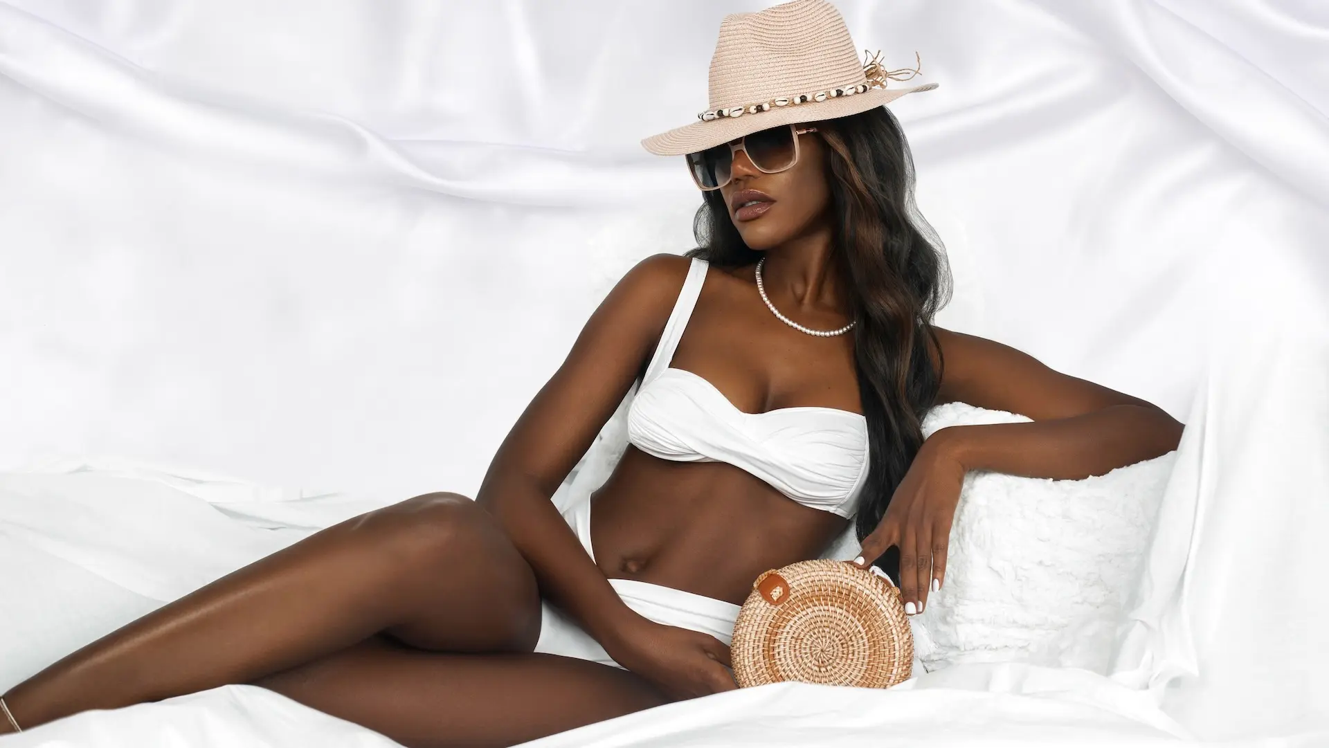
Commissioned by The Prestige Magazine, Ice Cream Sunscreen Dream was a high-key beauty editorial created to support a published story about sunscreen, representation and melanated skin. Two shot lists converted the white-on-white creative direction into eight planned compositions, while controlled lighting, styling and posing created a cohesive 24-image library with enough variation for an extended editorial feature.
Project at a Glance
| Commissioning publication | The Prestige Magazine |
|---|---|
| Editorial | Ice Cream Sunscreen Dream |
| Production date | May 11, 2022 |
| Format | Studio beauty and lifestyle editorial |
| Pre-production | Pinterest mood board and two shot lists covering eight planned compositions |
| Delivered library | 24 finished photographs |
| Supporting content | Behind-the-scenes video |
| Usage clearance | Model release on file |
| Published outcome | Editorial feature on The Prestige Magazine |
| Phil Halfmann’s contribution | Photography, lighting execution, camera-angle planning, on-set interpretation and delivery of the finished image set |
The Creative Challenge: Building Contrast Inside a White Set
A predominantly white set can easily lose structure. White wardrobe, bedding, drapery and props may merge into one flat surface, while exposure choices that protect the highlights can underrepresent darker skin tones. The production therefore needed to hold detail across the environment while keeping Vanessa’s complexion, expression and silhouette at the center of every frame.
The solution was not simply to make the scene brighter. Directional separation, controlled highlights and deliberate body angles created depth inside a restrained palette. This made the white environment feel soft and aspirational while preserving dimension in the skin and fabric.
Turning the Mood Board into an Executable Shot Plan
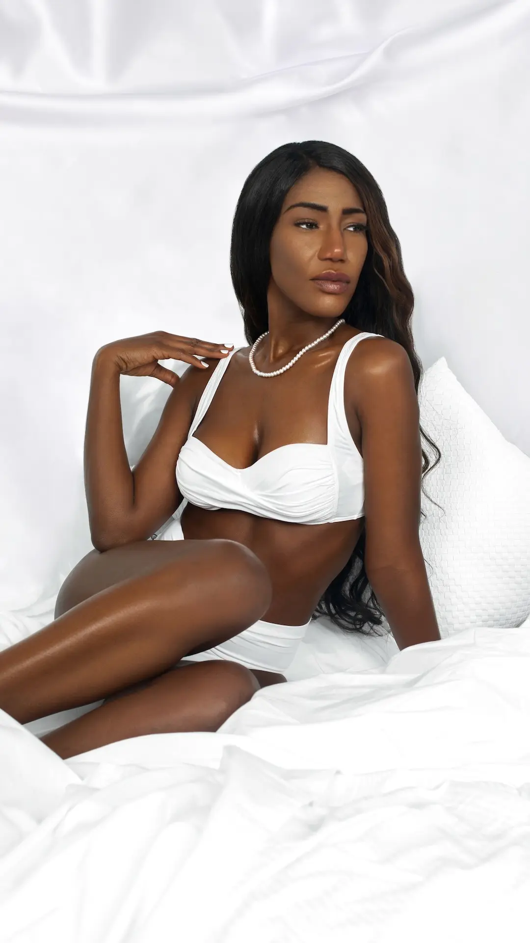
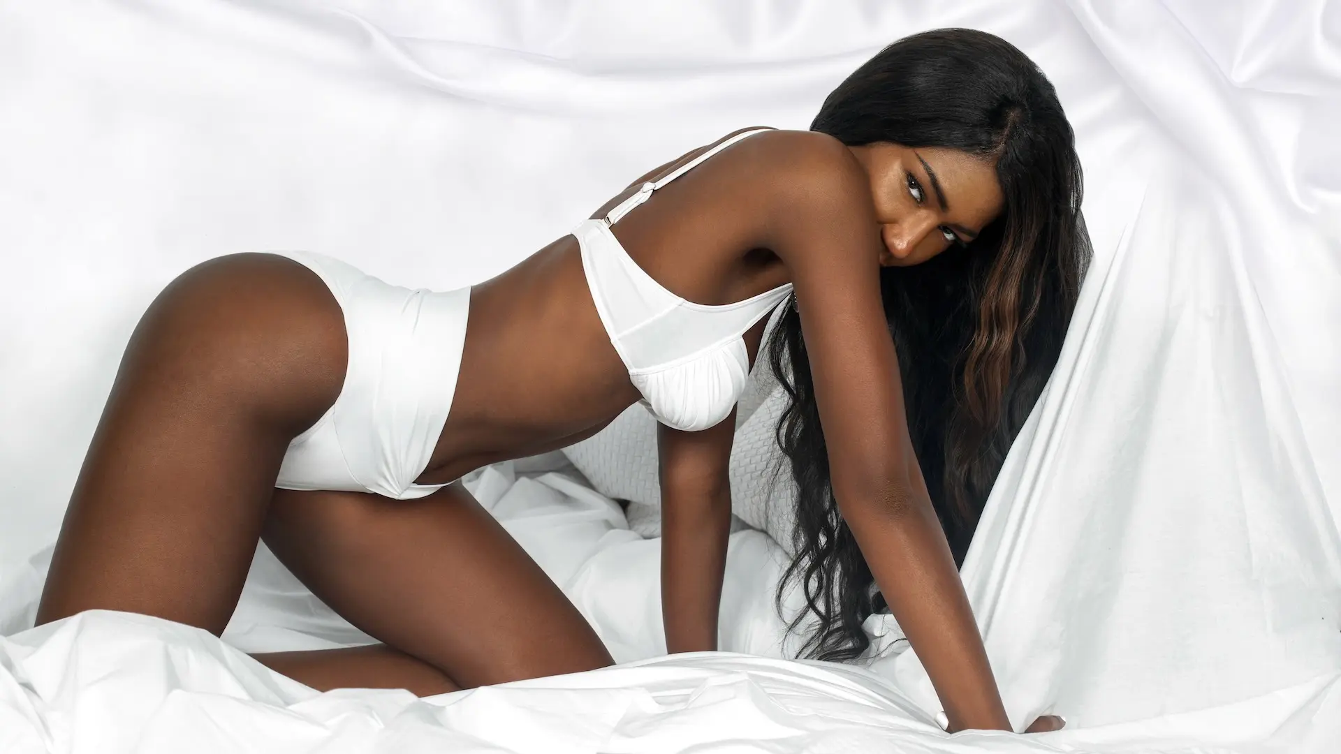
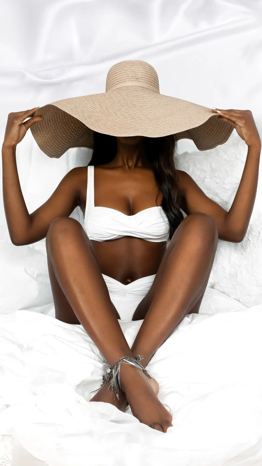
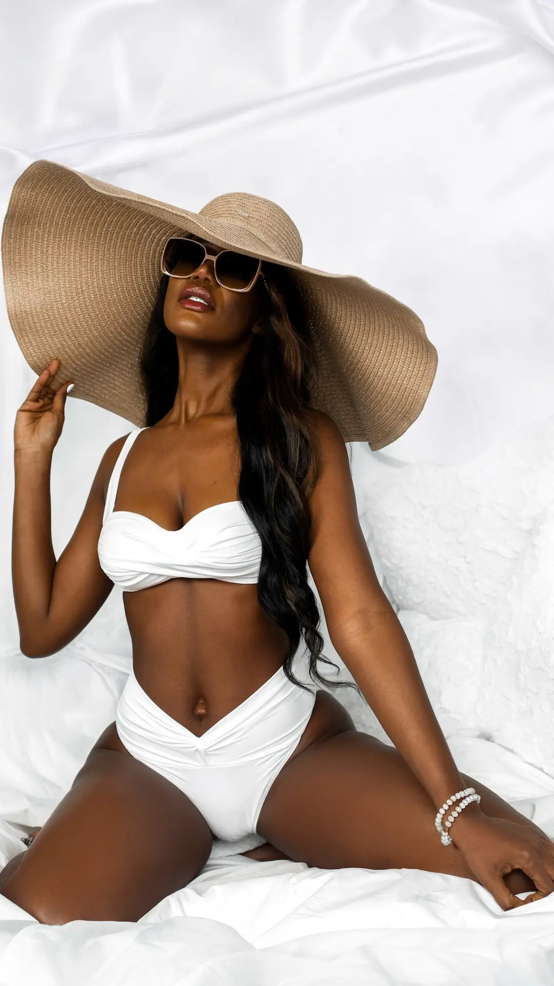
The mood board defined a relaxed summer mood: sun hats, white swimwear, tactile bedding and intimate beauty framing. The two shot lists made those references executable. Across the lists, the team planned seated full-length and three-quarter frames, reclining medium and full-body images, and close beauty compositions. Each setup specified a vertical priority, camera position and a two-light arrangement from the left and right.
That structure protected the required coverage without forcing every finished image to look identical. Pose, gesture, expression and prop interaction could evolve on set because the essential composition families were already defined. This is the practical value of a photography shot list: it gives the team a shared production framework while leaving room for responsive creative decisions.
For brands and creative teams, the larger lesson is that a mood board and a shot list do different jobs. References communicate taste and atmosphere; a shot list assigns coverage, format and priority. The two become most useful when they follow a clear campaign concept development process.
Creating Two Visual Chapters Without Breaking Cohesion
The final library moves through two related chapters. The first uses swimwear, a wide-brim hat, sunglasses and accessories to communicate a polished summer mood. The second reduces the styling and shifts toward bedding, a book, bare shoulders and closer beauty framing. Both chapters use the same high-key environment, controlled palette and relaxed body language.
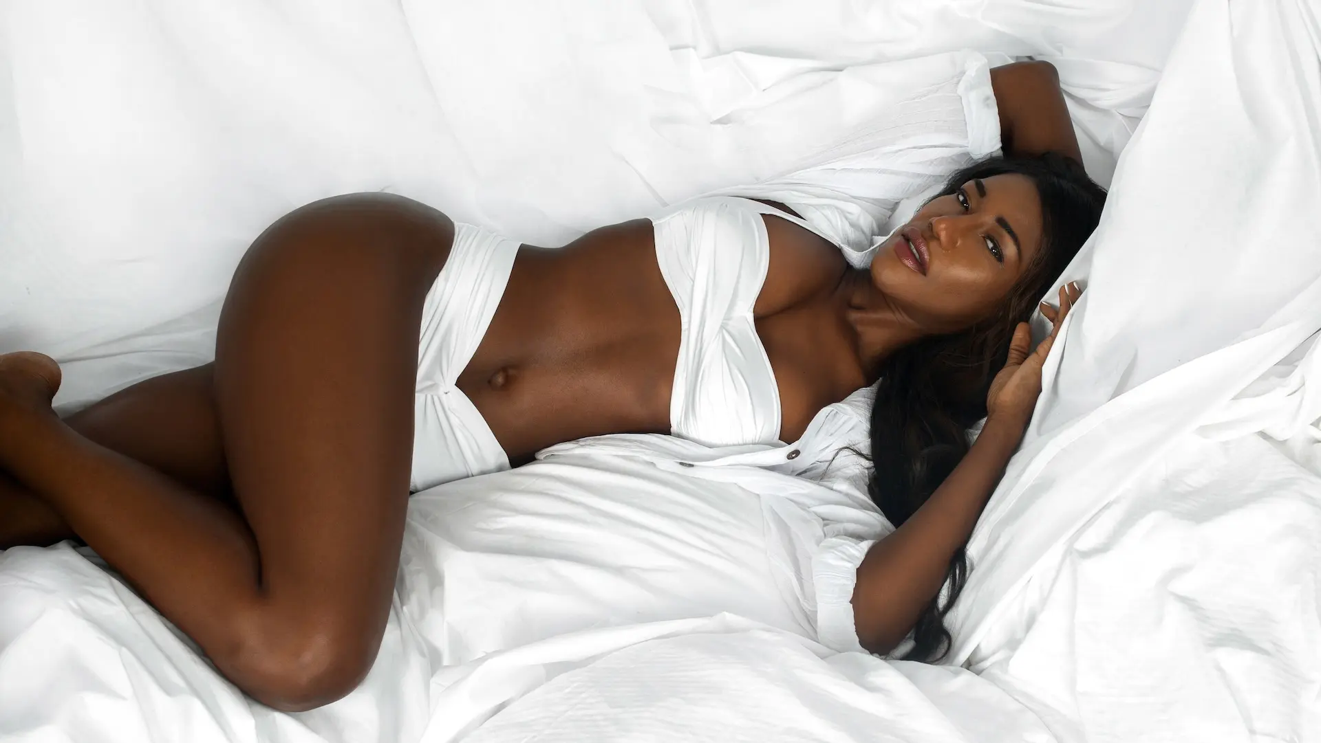
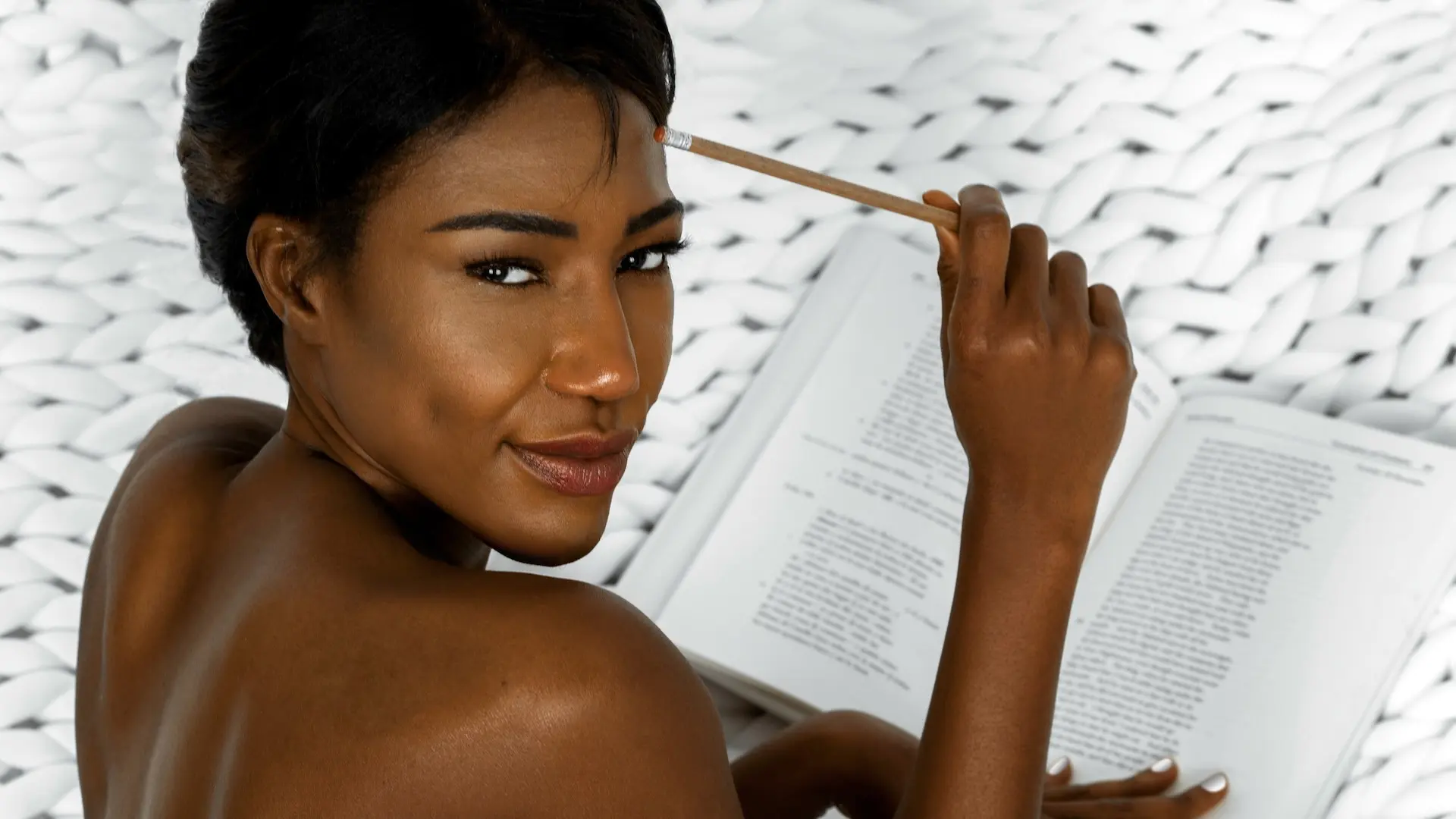
This controlled variation is useful well beyond an editorial. A beauty image library becomes more adaptable when the production plans distinct crops, orientations and emotional distances while protecting one recognizable visual identity. That same principle underpins effective beauty campaign photography.
Behind the Scenes
The behind-the-scenes film shows how the white set, lighting, pose direction and styling worked together during production.
The Published Outcome
The production delivered 24 finished photographs and supported “Sunscreen for Melanated Skin” on The Prestige Magazine. The final edit gave the publication a sequence that could move from summer fashion cues to intimate beauty imagery while staying inside one coherent white-on-white world.
No audience, conversion or revenue data was available for this case study. Accordingly, the page does not claim commercial performance. The verified outcomes are the commissioned production, the 24-image delivery, the model release, the BTS video and the published editorial.
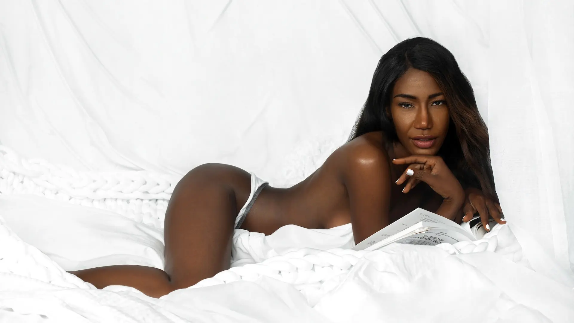
Selected Images from the Final Library
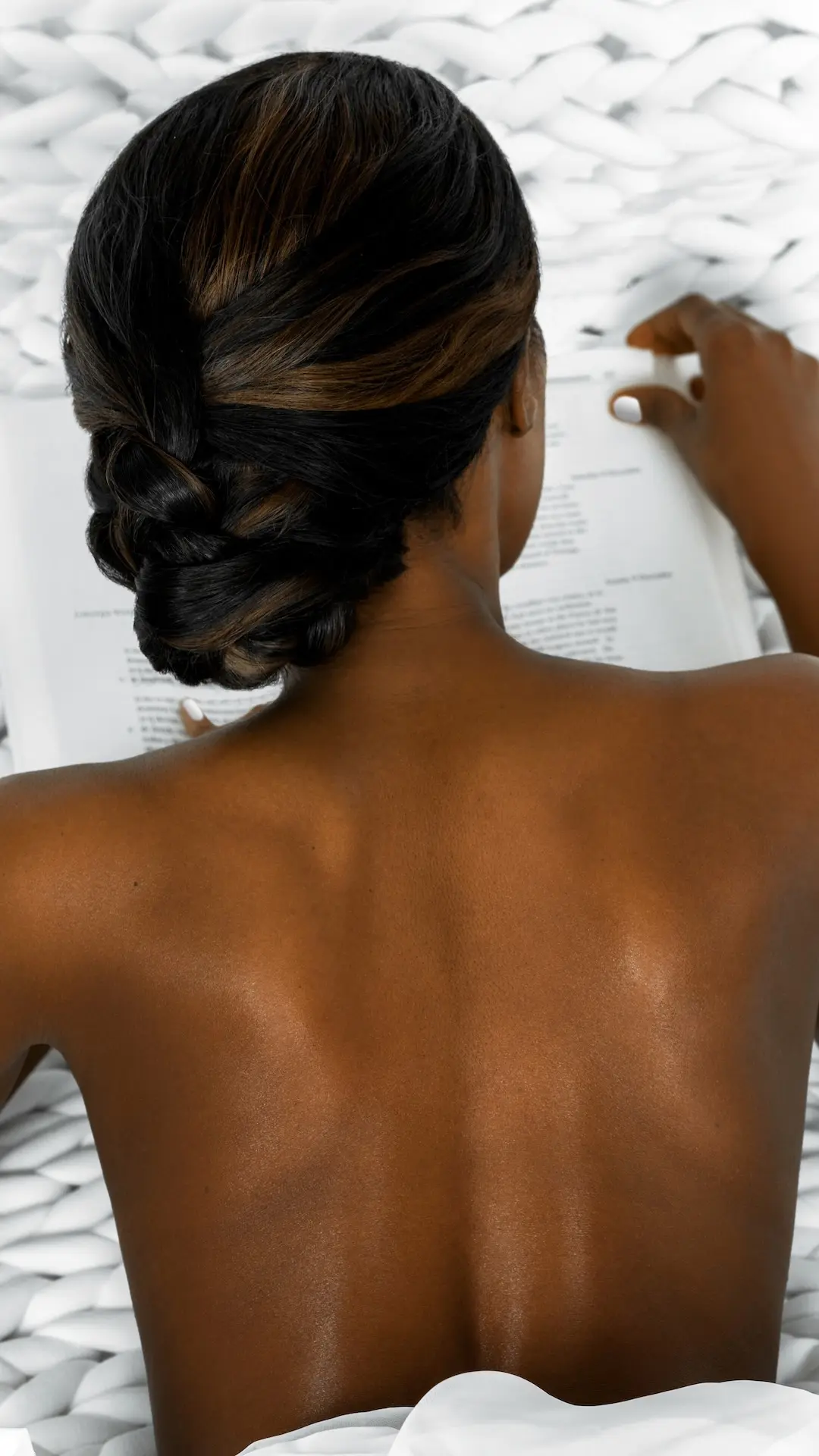
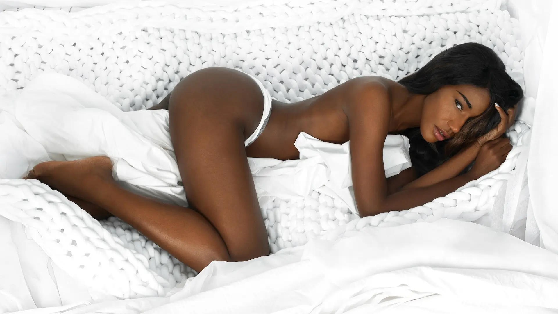
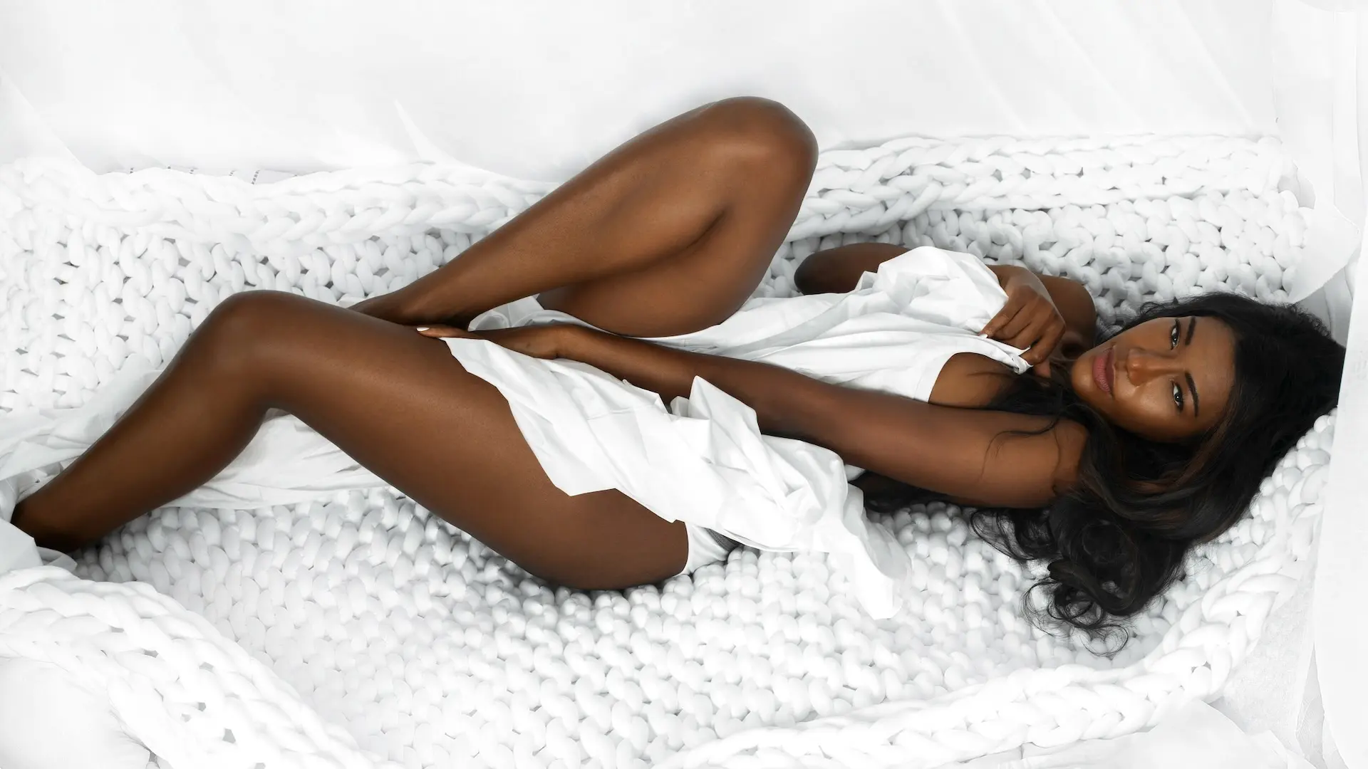
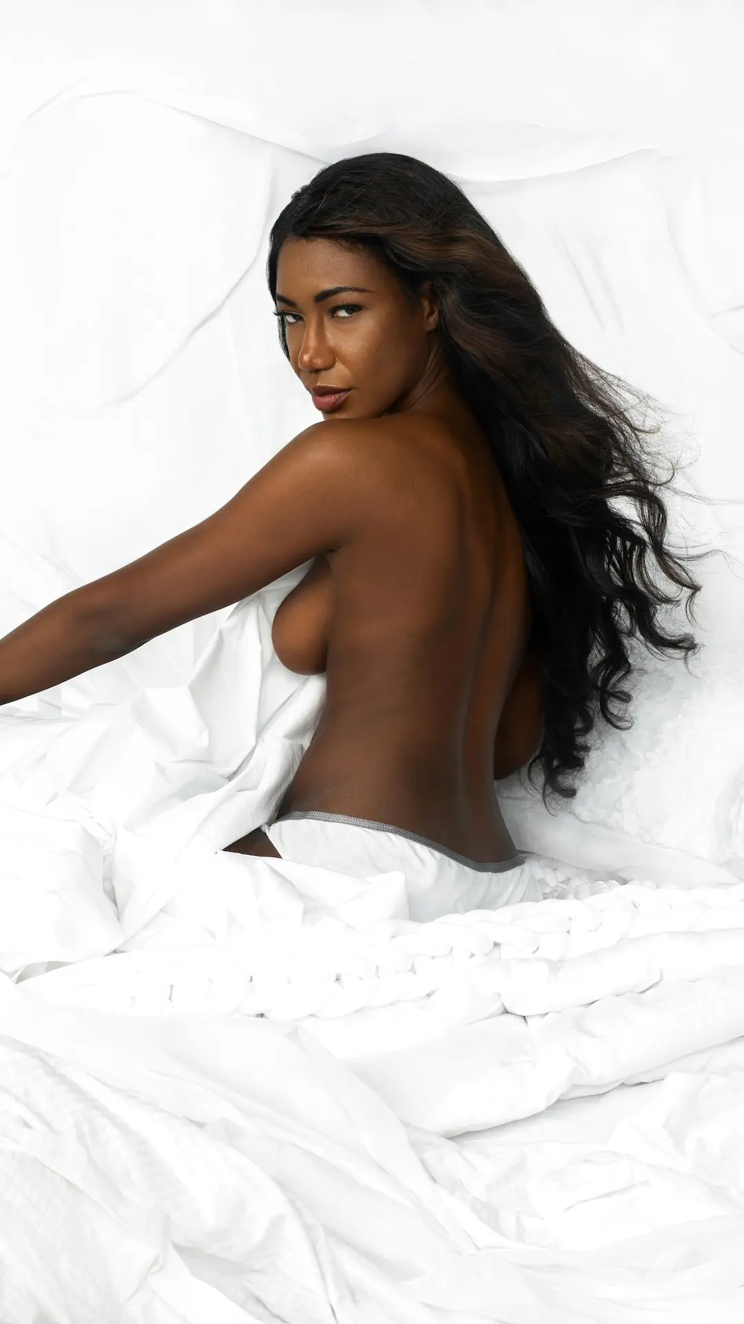
What Beauty and Creative Teams Can Learn
- Do not confuse brightness with good high-key lighting. White sets still need contrast, texture and controlled highlights.
- Expose for the subject and the environment. Skin tone and white materials both require dimensional separation.
- Use references to define atmosphere. Convert the mood board into specific crops, camera positions and priority shots before production.
- Build chapters inside one visual system. Styling can change while palette, lighting and emotional tone remain consistent.
- Plan crop and pose variety deliberately. A useful image library needs more than small variations of one composition.
- Keep outcome claims evidence-based. Publication and delivery prove execution; they do not prove sales or campaign performance.
For another example of how styling, controlled lighting and a limited set can become a cohesive published story, explore the Clean & Serene beauty editorial case study.
For a wider editorial project pairing portraits of women of color with writing on style and confidence, read the story behind Fortitudinous Women. It is a separate book project created by Phil Halfmann and Sophia Lenore.
Production Credits
- Commissioned by: The Prestige Magazine
- Photographer: Phil Halfmann
- Creative Director: Sophia Lenore
- Wardrobe Stylist: Pasquale Suriano
- Hair & Makeup Artist: Sophia Lenore
- Model: Vanessa
- Makeup: Charlotte Tilbury
- Hair products: L’Oréal
- Nail products: USLU Airlines
Planning a Beauty Campaign or Editorial?
A cohesive image library begins with a clear visual idea, planned coverage and lighting designed for the subject as well as the set. Book a Free Visual Audit to identify the visual gaps, production priorities and channel requirements your next campaign should address.