
The best ecommerce product image order does not simply arrange attractive photographs. It guides a shopper from recognition to understanding, then from confidence to purchase. Each image should answer the next question a customer is likely to ask: What is it? What does it look like from every angle? How large is it? What does the material or formula feel like? How is it used? And, finally, can I trust what I am buying?
Many product pages contain enough photographs but still communicate in the wrong order. A styled campaign image may create desire before the product is clear. A detail photograph may appear before the customer understands the whole. Meanwhile, essential information about scale, fit or application may sit at the end of a long gallery or be missing entirely.
Sequence matters because ecommerce photography replaces the physical inspection that happens in a store. Therefore, a strong product gallery should operate like a structured sales conversation. It should reduce uncertainty without making the customer work to find answers.
Why Ecommerce Product Image Order Matters
Shoppers rarely examine every image with equal attention. They scan. The first few frames must establish clarity quickly enough to earn continued interest. As a result, the order of the gallery affects how efficiently the page communicates value.
A deliberate sequence can support five commercial goals:
- Recognition: The shopper immediately understands the product
- Evaluation: Multiple views reveal shape, construction and important features
- Risk reduction: Scale, fit, texture and use become easier to judge
- Desire: Editorial or lifestyle imagery connects the product with an outcome or identity
- Decision support: Supporting images resolve final objections before purchase
This is the critical distinction: the gallery is not a portfolio. It is part of the product-page interface. Its job is not to display the photographer’s range but to help the customer make a better decision.
If your team is still determining which assets must be captured, start with the ecommerce photography checklist. The checklist defines the required coverage; this guide defines how that coverage should be presented.
The Best Ecommerce Product Image Order
There is no universal sequence for every SKU. However, the following eight-position framework is a reliable starting point for fashion, beauty and lifestyle brands. Treat it as a decision architecture, then adapt it to the product’s highest-risk buying questions.
1. Lead with a clear primary product image
The first image should make the product instantly identifiable. In most cases, use a clean front or three-quarter view with consistent lighting, crop and background treatment. The product should occupy enough of the frame to remain legible in category grids and on mobile screens.
Do not make the first image solve every marketing objective. Its main job is clarity. For established products with highly recognizable packaging, a controlled editorial treatment may work. However, a concept-led hero that partially hides the product creates unnecessary friction for unfamiliar brands.
2. Show the most informative secondary angle
The second image should reveal information the first cannot. Depending on the product, that may be a side profile, rear view, open view or alternate stance. The right angle is not automatically “the back”. It is the view that best advances understanding.
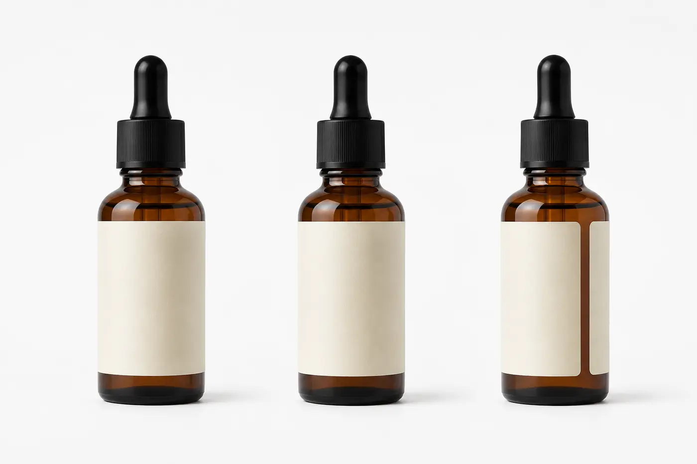
3. Reveal construction, texture or formula
Next, move closer. Show the evidence behind quality claims: stitching, hardware, seams, closures, fabric weave, applicator shape, powder finish, cream consistency or packaging detail. A strong detail image turns an abstract adjective such as “premium”, “soft” or “precise” into something visible.
4. Establish scale, fit or proportion
Scale is difficult to infer from an isolated packshot. Show the item on a model, in a hand, next to a familiar object or within a credible environment. For fashion, this position often becomes the first on-model full-length image. For beauty, it may show the bottle in hand or the applicator near the relevant area of the face.
Measurements still belong in product copy. Photography should clarify them, not replace them.
5. Demonstrate use, movement or application
Once the customer knows what the product is and how large it is, demonstrate what it does. Show a bag opening, a garment moving, a closure working, a serum dispensing or a lipstick applying. This image should resolve a functional question rather than act as decoration.
6. Show the outcome
For products defined by a visible result, show that result. Beauty brands might present finish, coverage or color on skin. Fashion brands can show silhouette, drape or styling. The outcome image connects product features with the benefit the customer wants.
7. Add lifestyle or brand context
Lifestyle imagery can now expand the story. At this point, the shopper already understands the item, so a more atmospheric image can strengthen desire and positioning without compromising clarity. The mistake is not using lifestyle photography but asking it to carry product information it was never designed to communicate.
8. Finish with reassurance or supporting information
The final positions should answer secondary objections. Depending on the SKU, use a packaging view, included-components image, shade comparison, care detail, size reference, ingredient context or compatible-product grouping. Infographics can help when the information genuinely benefits from labels. However, do not use graphic overlays to compensate for unclear photography.
The best ecommerce product image order is: primary product view, alternate angle, detail, scale or fit, use or application, visible outcome, lifestyle context and final reassurance. However, the order should change according to the product’s most important buying objection.
Example: Skincare Serum
- Clean front-facing packshot
- Three-quarter packaging view
- Applicator and dispensing mechanism
- Formula texture
- Bottle held in hand for scale
- Application photograph
- Finished skin appearance
- Carton, bottle and included components
Once the sequence is defined, use the PDP Image Checklist to verify coverage, accuracy, mobile behavior, accessibility and technical implementation before the product page goes live.

A Practical Eight-Image Sequence
| Position | Image role | Customer question | Common mistake |
|---|---|---|---|
| 1 | Primary product view | What is this? | Leading with an ambiguous campaign image |
| 2 | Secondary angle | What does the whole product look like? | Repeating nearly the same view |
| 3 | Detail or texture | What supports the quality claim? | Showing detail without context |
| 4 | Scale or fit | How large is it, or how does it fit? | Relying only on written dimensions |
| 5 | Use or application | How does it work? | Staging a gesture that explains nothing |
| 6 | Visible outcome | What result can I expect? | Using a result that is not representative |
| 7 | Lifestyle context | How does it fit into my life or identity? | Prioritizing atmosphere over product visibility |
| 8 | Reassurance | What final detail could prevent purchase? | Adding generic filler instead of resolving an objection |
How Ecommerce Product Image Order Changes by Product Type
The framework stays consistent, but the evidence changes. A shopper evaluating a dress faces different uncertainty from someone choosing a foundation or handbag. Therefore, prioritize the images that reduce the most consequential risk.
| Product type | Recommended early sequence | High-priority evidence |
|---|---|---|
| Fashion apparel | Clean on-model front → back/side → full silhouette → detail → movement | Fit, length, drape, fabric, closures and model measurements |
| Footwear | Three-quarter pair → side profile → top/rear → sole → on-foot | Shape, heel height, tread, material and scale on foot |
| Bags and accessories | Primary angle → alternate angle → open/interior → hardware → in-hand or on-body | Capacity, compartments, closures, strap length and material |
| Skincare | Packshot → package/dispensing view → texture → scale → application | Formula consistency, applicator, container size and routine use |
| Color cosmetics | Packshot → open product → swatch → application → finished result | Shade, finish, pigmentation, coverage and skin-tone context |
| Home and lifestyle | Isolated product → alternate angle → detail → room context → scale/use | Dimensions, material, capacity, assembly and spatial context |
The unspoken problem in many galleries is that brands sequence images according to production convenience. Files arrive grouped by setup, so the website inherits that order. Customers do not care how the shoot was organized but whether the gallery resolves their uncertainty in the fewest useful steps.
Optimize the Ecommerce Product Image Order for Mobile
Mobile makes weak sequencing more costly. The viewport reveals less information, thumbnails may be hidden, and each swipe requires effort. Therefore, the first three images must carry the core decision story.
- Make position one unmistakable. Use a crop that stays legible at small sizes
- Use position two to add new information. Avoid a minor pose or angle change
- Put the leading buying objection in position three. For apparel, that may be fit or fabric. For beauty, it may be texture or shade
- Keep crops visually stable. Large changes in product scale make swiping feel inconsistent
- Review the live page, not only the asset folder. Theme behavior, image containers and mobile cropping can change the intended hierarchy
Also consider page speed. Every image should be exported at the appropriate dimensions, compressed efficiently and delivered in a modern format such as WebP. More images are only useful when they add decision value and load without undermining the experience.

Common Product Gallery Sequencing Mistakes
Opening with mood instead of clarity
A campaign image can create attention but it may perform poorly as the primary ecommerce image when the product is small, obscured or visually secondary. Use atmosphere after recognition unless testing shows a different order performs better.
Showing several near-duplicate angles
Volume can create the illusion of completeness. Yet five similar images do not answer five different questions. Give every frame a defined communication role.
Placing essential evidence too late
If customers need to know fit, texture, shade or capacity, do not bury that information. Rank images by decision importance, not by visual drama.
Using one fixed template for every category
Consistency helps comparison, but rigid uniformity can hide category-specific information. Build a shared system with controlled variations for each product type.
Overpromising through retouching
Retouching should improve consistency and remove production distractions but not materially change color, texture, fit or outcome. A visually stronger image can still be commercially weaker if it creates inaccurate expectations.
How to Test Your Ecommerce Product Image Order
Best practice is a starting hypothesis, not proof. The right sequence should be evaluated with product-page behavior and commercial outcomes.
- Compare image engagement and gallery depth
- Review add-to-cart and conversion rates by product template
- Analyze returns and customer-service questions for recurring uncertainty
- Run controlled tests on the first image or first three positions
- Segment findings by device, traffic source, category and new versus returning customer
Do not assume that the image receiving the most interaction is automatically the most persuasive. High engagement can indicate interest but it can also reveal confusion. Connect image behavior with conversion, returns and customer feedback before drawing conclusions.
The same principle applies beyond product pages. Your end-to-end content system should connect production, delivery, publishing and performance analysis so future shoots benefit from what customers actually do.
Plan the Product Image Sequence Before Production
The ecommerce product image order should be defined during pre-production, not improvised during upload. Begin with the customer’s likely questions, translate them into image roles and then build the shot list.
- Identify the primary product promise. What must the customer understand immediately?
- List the buying risks. Consider fit, scale, color, texture, function, compatibility and included components
- Assign one job to each image. Remove frames that only duplicate existing information
- Define category standards. Establish crops, angles, backgrounds, model conventions and retouching rules
- Plan channel derivatives. Capture enough flexibility for product pages, category grids, email, organic social and paid media
- Name and deliver assets in sequence. A clear naming system prevents the intended order from disappearing during handoff
Use a photography shot list template to connect each frame with its purpose, crop and destination. Then preserve that logic through your marketing asset delivery workflow and visual content library management system.
For beauty brands, the multi-channel beauty product photography case study shows how one planned production can supply ecommerce, social and promotional uses without creating disconnected visual systems.
The Strategic Principle: Sequence Images by Customer Decisions
A high-performing gallery does not need the maximum number of photographs but the minimum complete set of evidence required for a confident purchase.
Start with recognition. Add dimensional understanding. Reveal quality. Establish scale. Demonstrate use. Show the outcome. Then strengthen desire and resolve final objections. This creates an ecommerce product image order that feels natural because it follows the shopper’s decision process.
When the sequence is planned before the shoot, photography becomes more efficient as well. The team knows which images are essential, which setups can supply several formats and which details need accurate documentation. That is how product photography becomes part of a scalable content system rather than a folder of attractive but disconnected files.
Is Your Product Gallery Answering the Right Questions?
A Free Visual Audit can identify gaps, duplicated image roles and opportunities to make your ecommerce photography work harder across product pages, campaigns and paid media.
Frequently Asked Questions About Ecommerce Product Image Order
What is the best order for ecommerce product photos?
Begin with a clear primary product image. Follow it with an informative alternate angle, detail or texture, scale or fit, use or application, visible outcome, lifestyle context and final reassurance. Adapt the order to the product’s most important buying objections.
How many images should an ecommerce product page have?
Use enough images to answer the customer’s material questions without repetition. Many products can be explained through six to eight purposeful images, but complex, high-consideration or variation-heavy products may need more. Image count should follow decision needs rather than a fixed quota.
Should a lifestyle image be first?
Usually, a clear product-led image is the safer first position because it supports recognition in category grids and on mobile. A lifestyle image can lead when the product remains unmistakable and performance data supports that choice.
Should product videos appear early in the gallery?
Place video early when movement, operation or fit is central to the decision. However, the primary still image should normally establish the product before the customer is asked to play or watch content.
Should every SKU use the same image sequence?
Products within one category should share a consistent structure so customers can compare them easily. However, the sequence should allow controlled variation when different products have different risks, features or use cases.