
Homepage banner planning should begin before a photographer steps onto the set or a designer opens a layout. Your homepage hero is often the largest and most visible campaign placement on your website. Therefore, it should not be treated as a decorative crop selected after production. It should be planned as a commercial asset with a clear audience, message, product priority and next action.
What Is Homepage Banner Planning?
Homepage banner planning is the process of defining the strategic, creative and technical requirements for the primary visual area of a website before assets are produced or selected. It connects the business objective, audience, campaign message, image direction, copy, call to action, device crops, launch timing and measurement plan.
In other words, the banner is not a single image. It is a coordinated system of image variants, message elements and links that must perform across several viewing conditions.
Strong homepage banner planning should answer six questions:
- What commercial or communication objective does the banner support?
- Which visitor or customer segment should recognize that it is relevant?
- What should the visitor understand within the first few seconds?
- Which product, collection or story deserves priority?
- What action should the visitor take next?
- Which asset variations are required across devices and markets?
This approach fits within a broader fashion brand content strategy. That cornerstone guide explains how business goals, campaigns, channels and production should work as one content system rather than as disconnected creative tasks.
Why Homepage Banners Commonly Underperform
Poor performance is rarely caused by photography alone. More often, the banner has not been given one clear job.
A homepage team may want the same hero to announce a collection, promote a discount, explain brand positioning and direct visitors toward several product categories. Yet when every message receives equal weight, nothing feels important. Consequently, the visual may look premium while the experience remains unclear.
Other common problems include:
- selecting imagery before defining the offer
- using one crop for every device
- placing essential products near crop-sensitive edges
- writing copy that repeats what the image already communicates
- adding several competing calls to action
- loading large assets that weaken page speed
- leaving an outdated campaign live for too long
- measuring clicks without considering downstream behavior
The unspoken problem is that the most beautiful campaign image is not automatically the best homepage image. A tightly framed portrait may be outstanding for editorial use, for example, but unsuitable for a wide hero with a headline and button. Homepage banner planning requires selection by function, not preference.
Start Homepage Banner Planning With One Business Objective
First, choose the primary outcome. A banner can support a new collection, a hero product, a seasonal edit, an editorial story, a promotion or a brand message. It can also guide returning customers toward what has changed. However, each objective requires a different balance of image, copy and navigation.
For a collection launch, the banner may need to establish the campaign world and link to the collection landing page. For a hero product, it may need stronger product visibility and a shorter path to purchase. Meanwhile, an awareness-led brand story may prioritize emotion and distinctiveness over immediate product detail.
Your fashion product launch strategy should determine which role the homepage plays before the production brief is approved. Likewise, the fashion marketing strategy cornerstone explains why creative, channels and commercial priorities need to be aligned before campaign execution.
The homepage banner should help [audience] understand [message or offer] and take [primary action].
If the sentence contains several audiences, messages or actions, the brief is probably still too broad.
Define the Message Hierarchy Before Choosing the Image
Next, determine what the visitor must notice first, second and third. A clear ecommerce homepage banner usually contains four layers:
- Visual signal: the image establishes relevance, product category and emotional tone.
- Headline: the main message gives the campaign or offer meaning.
- Supporting line: optional context clarifies the value, timing or proposition.
- Call to action: the button names the next step.
Not every banner needs all four layers. In fact, fewer elements often create a stronger hierarchy. Nevertheless, removing copy only works when the image and navigation make the destination obvious.
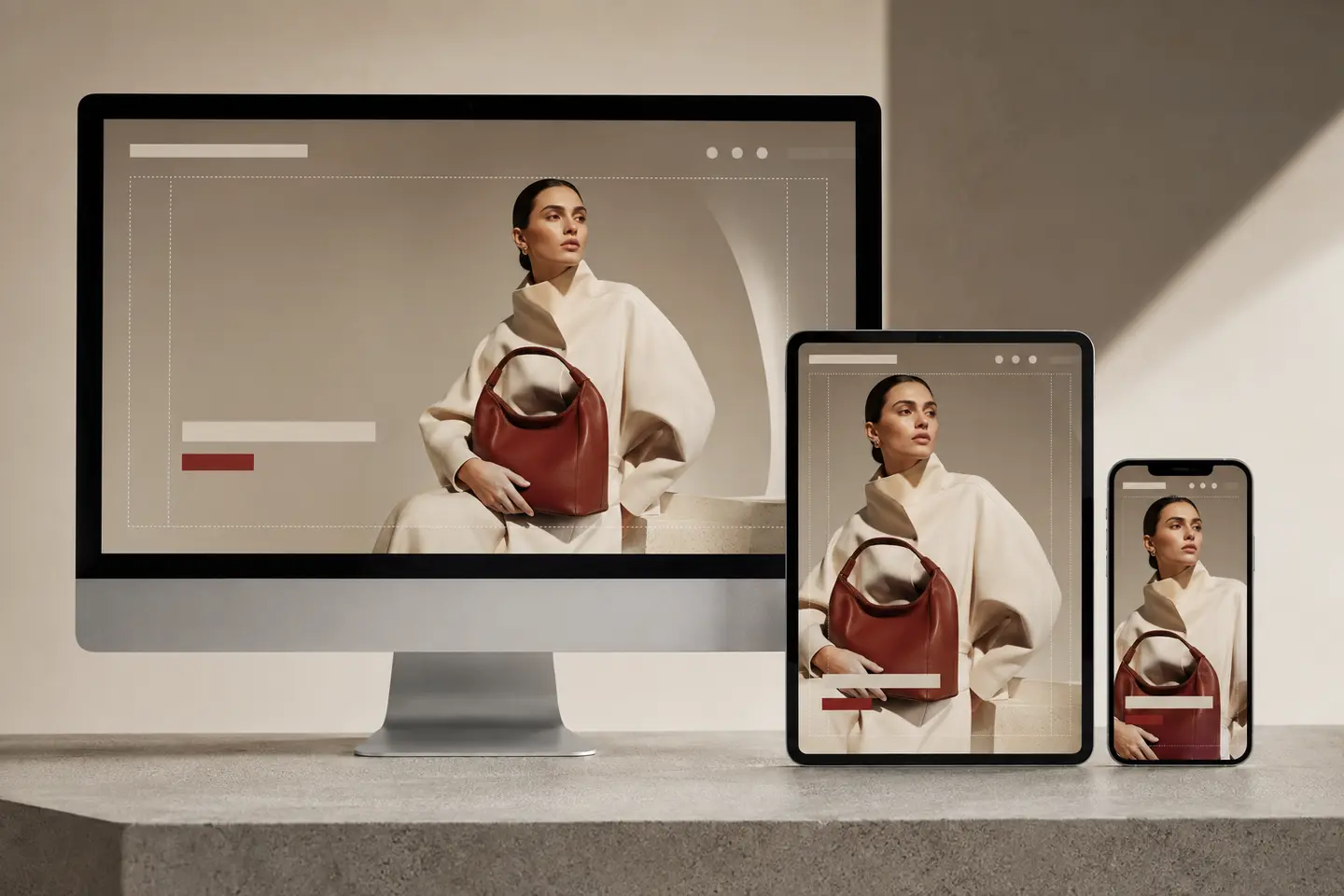
Headline and image should complement each other rather than compete. If the photograph clearly shows the new collection, the headline does not need to describe the clothing. Instead, it can introduce the campaign idea or customer benefit. Conversely, if the image is abstract, copy may need to provide more concrete orientation.
As part of homepage banner planning, create the copy direction before the final image selection. This allows the creative team to assess negative space, contrast and subject placement realistically.
Build a Website Hero Image Strategy Around Composition
A website hero image strategy begins with the intended interface, not with a generic landscape crop. The photographer, art director and designer should know where navigation, headline, supporting copy and buttons are likely to appear.
Therefore, the production brief should define:
- preferred subject placement
- required negative space
- product visibility priorities
- safe zones for faces, hands and packaging
- light and dark areas behind copy
- acceptable crops for different breakpoints
- whether the image can be mirrored without creating visual errors
- whether the layout needs a text-free mobile alternative

During the shoot, capture both left-weighted and right-weighted compositions when possible. Also create wider frames than the desktop design appears to require. This provides flexibility for responsive banner design, translations and future layout adjustments.
The same principle applies beyond the homepage. The content planning for fashion brands article shows how one production can generate multiple months of channel-ready assets when placements are mapped in advance.
Plan Responsive Banner Design as Separate Art Direction
Responsive banner design is not simply automatic cropping. Desktop and mobile screens create fundamentally different compositions. A wide desktop image can hold a model on one side and copy on the other. On mobile, however, that same layout may reduce the product to a small detail or remove the subject entirely.
Therefore, plan at least three treatments:
- Desktop: a wide composition with deliberate copy space
- Tablet: a tighter horizontal or near-square crop
- Mobile: a portrait or mobile-specific composition with simplified copy
In some cases, the best answer is a separate mobile frame captured during the same production. This is not redundant output. Instead, it is channel-specific art direction.
Place essential information in a central safe area, but do not assume center composition solves every problem. A centered model may remain visible across crops, yet it can leave no room for a headline. Consequently, the shot list should include several compositional solutions.
The visual should also be tested on real devices. Browser previews are useful, although they cannot fully represent every screen size, browser bar or accessibility setting. Review common breakpoints, then confirm that faces, products, gestures and typography remain intentional.
Connect Campaign Asset Planning to the Shot List
Campaign asset planning turns the banner brief into production requirements. Instead of asking for “a homepage image,” list the exact deliverables and their intended use.
| Asset | Composition | Primary use |
|---|---|---|
| Desktop hero | Wide landscape with copy space | Homepage desktop |
| Alternate desktop hero | Opposite subject placement | Copy/layout testing |
| Tablet crop | Tighter landscape or square | Tablet layouts |
| Mobile hero | Portrait composition | Mobile homepage |
| Product-led variant | Product clearly dominant | Conversion-focused test |
| Editorial variant | Strong campaign atmosphere | Brand-led test |
| Text-free export | Clean image without embedded type | Flexible localization |
| Motion loop | Short, subtle movement | Optional homepage video hero |
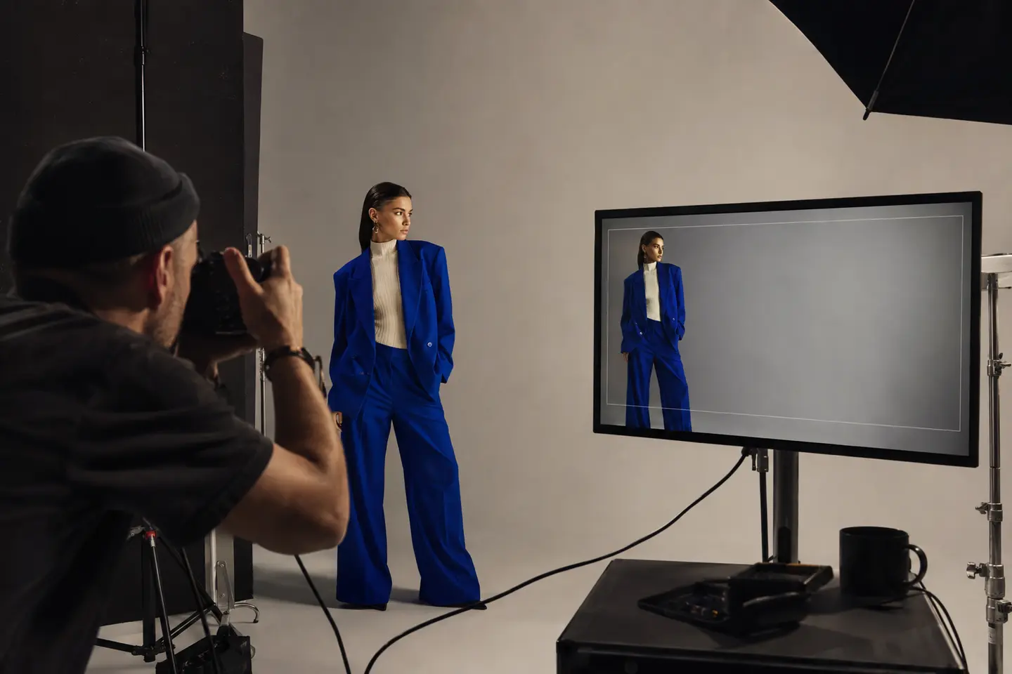
This asset map should appear in the creative brief, call sheet and delivery structure. Moreover, filename conventions should identify campaign, placement, device, crop and version. That reduces confusion when several teams use the same library.
If the campaign must also support product pages, use the fashion ecommerce images cornerstone and the product page image guide to separate homepage storytelling needs from product-detail conversion needs.
Balance Brand Storytelling and Product Clarity
Fashion and beauty homepages often lean toward one of two extremes. Some prioritize atmosphere so heavily that visitors cannot tell what is being sold. Others make the product visible but remove the emotional world that creates desire.
The stronger solution depends on the visitor’s context and the campaign stage. For a recognized brand with high direct traffic, an editorial hero may build anticipation effectively. For paid traffic entering through the homepage, clearer product and offer cues may be necessary. Likewise, a new product category often needs more explanation than an established bestseller.
Homepage banner planning should therefore consider traffic source, audience familiarity and purchase intent. There is no universally “best” balance. There is only the balance most appropriate to the job the banner has been assigned.
The article on why campaign visuals are not converting expands on the difference between visual appeal and commercial usefulness.
Protect Readability, Accessibility and Page Speed
A banner cannot perform if visitors cannot read it or if it slows the page substantially. Therefore, technical requirements belong inside the creative brief.
Use real HTML text for headlines and calls to action whenever possible. Text embedded within an image is harder to update, translate and scale. It may also create accessibility problems. In addition, maintain sufficient contrast between copy and the visual background. A gradient overlay can help, although it should support the photography rather than conceal a composition problem.
Alt text should describe the meaningful content of the photograph. It should not repeat the headline or become a list of keywords. If the banner is purely decorative and adjacent text communicates the same information, implementation may call for empty alt text. The correct decision depends on the image’s function.
For performance, export modern formats such as WebP, size each file close to its display dimensions and avoid uploading one enormous image for every breakpoint. Compression should reduce weight without damaging skin, fabric texture or product detail. Moreover, the development team should prevent layout shifts by defining image dimensions or aspect ratios.
Create a Homepage Banner Planning Calendar
Even a strong banner loses relevance. Therefore, connect updates to the launch and merchandising calendar rather than waiting until the homepage feels stale.
For each banner, document:
- go-live and removal dates
- campaign owner
- linked destination
- inventory or offer dependencies
- geographic or language variants
- approval deadline
- replacement asset
- performance review date
This prevents expired offers, sold-out products and old seasonal campaigns from occupying the most valuable space on the website. The fashion campaign calendar and fashion campaign timeline provide broader planning frameworks for aligning launches, production, approvals and deployment.
Test Ecommerce Homepage Banners Against a Clear Hypothesis
Testing is useful only when the variables and outcomes are defined. Randomly changing an image may produce a different result, yet it may not explain why.
A product-led hero with a specific collection call to action will increase qualified collection visits because visitors can identify the offer faster.
Potential test variables include:
- product-led versus editorial imagery
- model versus still life
- short versus explanatory headline
- one call to action versus two
- light versus dark copy treatment
- static image versus restrained motion
- campaign landing page versus category destination

Do not judge ecommerce homepage banners by click-through rate alone. A more aggressive message may generate more clicks but lower product engagement or purchase quality. Therefore, examine landing-page behavior, product views, add-to-cart rate, conversion, revenue per session and bounce or exit patterns where appropriate.
At the same time, avoid claiming causation when the test has too little traffic, several variables change together or a promotion distorts demand. The goal is not to manufacture certainty but to make the next creative decision with better evidence.
A Practical Homepage Banner Planning Workflow
1. Define the campaign role
Choose the business objective, audience, message and primary action.
2. Confirm the destination
Make sure the linked page continues the same promise. A strong hero cannot compensate for an irrelevant landing experience.
3. Write the message hierarchy
Draft the headline, optional supporting line and call to action before final image selection.
4. Map device requirements
Define desktop, tablet and mobile compositions, safe zones and export sizes.
5. Add the banner to campaign asset planning
Translate placements into a shot list, crop list and delivery specification.
6. Produce purposeful variations
Capture alternate subject positions, wider frames and product-led or editorial options where testing justifies them.
7. Review image and interface together
Assess the photograph inside the actual header, navigation, typography and button system.
8. Optimize delivery
Export correctly sized WebP files, apply meaningful filenames and verify responsive loading.
9. Quality-check before launch
Test crops, links, contrast, readability, accessibility, load behavior and destination consistency.
10. Measure and document the result
Record the hypothesis, dates, creative version and relevant outcomes so insights can inform the next campaign.
For a wider campaign review, use the fashion marketing checklist.
Homepage Banner Planning Checklist
- The banner has one primary objective.
- The audience and message are clear.
- The linked destination matches the promise.
- The product or story priority is obvious.
- The headline and image complement each other.
- The call to action names a useful next step.
- Desktop, tablet and mobile assets have been reviewed.
- Faces, products and gestures remain inside safe crops.
- Copy remains readable against the image.
- No essential text is embedded in the artwork.
- WebP files are correctly sized and compressed.
- Image dimensions prevent layout shifts.
- Alt text reflects the image’s function.
- Launch and removal dates are documented.
- Analytics and testing requirements are ready.
Frequently Asked Questions About Homepage Banner Planning
What size should a homepage banner image be?
There is no universal size because themes, content widths and device breakpoints differ. Start with the actual rendered dimensions of your website. Then export separate desktop and mobile assets at an appropriate pixel density, while keeping file weight controlled. Avoid relying on one oversized image for every device.
How often should ecommerce homepage banners change?
The correct cadence depends on product launches, promotions, inventory and audience behavior. Update the banner when the commercial priority changes or the creative becomes stale. However, do not rotate imagery simply to make the homepage appear active. Every change should have a strategic reason.
Should a homepage hero use a model or a product image?
Use the approach that best supports the objective. A model may communicate fit, identity and aspiration, while a product-led image can improve clarity and focus. Test meaningful alternatives when traffic permits, but do not assume one format wins for every campaign.
Should text be added directly to a banner image?
Usually, no. Live HTML text is easier to update, translate, resize and make accessible. Embedded text may be justified in a tightly controlled creative execution, although it reduces flexibility and requires device-specific versions.
How many calls to action should a homepage banner include?
One primary call to action is usually clearest. A second may be useful when two destinations have comparable importance, such as women’s and men’s collections. Nevertheless, multiple buttons can divide attention and weaken measurement.
How does homepage banner planning improve photography ROI?
It ensures the production creates assets that fit real placements across devices, campaigns and markets. Consequently, teams spend less time forcing unsuitable images into layouts, while the photography becomes easier to deploy, test and reuse.
Turn the Homepage Hero Into Working Media
The homepage banner is not merely the largest photograph on your website. It is a high-value media placement where brand positioning, campaign storytelling, merchandising and conversion meet.
Therefore, homepage banner planning should happen before production, not after it. When the objective, message, crop system, shot list, technical requirements and measurement plan are aligned, the creative team can build an asset that looks intentional and works harder across the customer journey.
If your current homepage depends on whichever campaign image happens to fit, the issue is not simply design. It is a planning gap. A Free Visual Audit can help identify whether your campaign visuals are being designed for the placements, formats and commercial demands they need to support.