
 Many brands still treat photography as decoration. They commission a polished hero image, add several standard packshots and assume the page is complete. However, a shopper may still be unable to judge fit, scale, texture, construction or real-world use. The page looks premium, yet the buying decision remains difficult.
What Makes Product Photography Conversion-Focused?
Conversion-focused photography begins with decision strategy rather than a shot list. First, the team identifies what customers need to believe before they buy. Next, it maps each belief to visual evidence. Finally, it sequences that evidence so the product page moves from attention to understanding and then to confidence.
In other words, the image is not judged only by lighting, styling or composition. It is also judged by the work it performs. A useful frame may communicate shape. Another may prove material quality. Meanwhile, a third may show scale or demonstrate use. Together, the images reduce uncertainty in a way that isolated campaign photographs rarely can.
This does not mean creative direction becomes less important. On the contrary, strong art direction makes information easier to absorb and reinforces the brand’s position. Nevertheless, beauty without clarity can create attention without action. The goal is to combine commercial persuasion, factual accuracy and a distinctive visual identity.
Individual images matter, but conversion also depends on the order customers encounter those product photos.
A Product Image Should Answer A Buying Question
Before approving any photograph, ask a direct question: What does the customer understand after seeing this image that they did not understand before? If the answer is unclear, the frame may be visually appealing but commercially redundant.

For example, a fashion shopper may want to know whether a garment is structured or fluid, where it sits on the body and whether the fabric is opaque. A beauty customer may need to see the applicator, texture, finish and package size. Likewise, an accessories customer may want to understand capacity, closure, interior organization and strap length.
Therefore, effective ecommerce product photography is category-specific. A universal eight-image template can be a useful starting point, but it cannot replace customer research. Reviews, returns, customer-service questions, search terms and on-site behavior reveal the information shoppers are missing. Consequently, those inputs should shape the photography brief.
How Conversion-Focused Product Images Reduce Purchase Friction
Purchase friction is any doubt, effort or perceived risk that delays a decision. Some friction comes from price or delivery. However, a large share comes from incomplete product understanding. Conversion-focused product images address four forms of visual friction:
- Recognition friction: The shopper cannot immediately tell what the product is or which feature matters
- Evaluation friction: The shopper cannot assess material, quality, fit, size or function
- Imagination friction: The shopper cannot picture the product in a relevant context
- Trust friction: The imagery feels inconsistent, exaggerated or disconnected from what will arrive
Accordingly, the solution is not always “more images”. Additional frames help only when they add useful evidence. Ten nearly identical angles can increase cognitive load without improving understanding. Instead, a concise sequence of complementary images often performs better because every frame has a distinct role.
Build The Seven-Image Conversion Sequence
A strong sequence should mirror the shopper’s decision process. Although the exact order will vary by category, the following seven functions create a reliable framework for product page photography.
- Lead with immediate recognition. The first image should identify the product quickly, preserve an accurate silhouette and remain legible on mobile. Because this frame often appears in category grids and ads, unnecessary props can weaken clarity
- Show the complete form. Front, back and relevant side views help shoppers understand proportion and construction. For fashion, show the garment on-body when fit is central. For beauty or accessories, keep the scale and camera perspective consistent
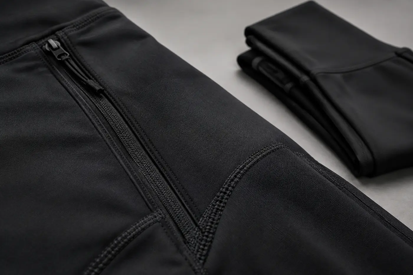
- Prove the material. Use close detail to reveal fabric, grain, finish, stitching or formulation. Moreover, control retouching so texture remains credible rather than plastic
- Explain the differentiator. If the product has a special closure, lining, applicator, compression panel or adjustable component, show it clearly. Otherwise, the customer may never notice the feature described in the copy
- Establish scale or fit. Place the product in a hand, on a body or beside a familiar object. However, choose a reference that feels natural rather than artificial
- Demonstrate use. Show the product performing its intended job. Movement, application or capacity can turn an abstract benefit into visible evidence
- Complete the aspiration. Finish with a lifestyle or editorial frame that connects function to identity. At this stage, mood supports desire because the previous images have already established clarity
If you need a broader production checklist, use the Ecommerce Photography Checklist. In addition, the Product Page Image Guide explains how to assemble these assets into a complete product-page system.
Balance Clarity, Desire And Proof
The most effective conversion-focused product images balance three jobs. Clarity helps the shopper identify and understand the item. Desire makes the product feel relevant and valuable. Proof supports the claims made by the product description.
| Image job | Customer question | Useful image types | Common mistake |
|---|---|---|---|
| Clarity | What exactly am I buying? | Clean hero, full view, alternate angle | Styling obscures the product |
| Desire | Is this right for someone like me? | On-model, lifestyle, editorial context | Mood replaces product information |
| Proof | Why should I believe the claim? | Macro detail, demonstration, comparison | The image repeats the copy without evidence |
Brands often overinvest in desire because aspirational images are exciting to produce. Yet shoppers may already want the product. What they lack is confidence. Therefore, a detail image that proves quality can sometimes contribute more to the sale than another dramatic campaign frame. This is where strategic ecommerce product photography becomes a sales asset rather than a visual expense.
Conversely, pure documentation can make a premium product feel generic. The solution is not to choose between commercial accuracy and editorial value. Instead, build a visual hierarchy in which clean product views establish truth while campaign-level frames express the brand promise. The Fashion Ecommerce Images guide explores this balance in greater depth.
Show Scale, Fit And Real-World Use
Scale is one of the most common information gaps in online shopping. Dimensions may appear in the description, but customers do not always translate numbers into a physical impression. Consequently, a visual reference can make size instantly understandable.

For beauty products, show the bottle in a hand and include the applicator or dose when relevant. For bags, show how the item sits on the body and what fits inside. For fashion, use consistent model measurements, multiple views and movement to communicate silhouette. Furthermore, explain styling choices when they could change the perceived fit.
Accuracy is essential. Wide-angle distortion, aggressive body reshaping or inconsistent product scale may make an image more dramatic, but they can also set false expectations. As a result, short-term visual impact can create long-term costs through returns, complaints and lost trust. Truly high-converting product visuals persuade without misrepresentation.
Use Consistency To Make Comparison Easier
Consistency is not merely an aesthetic preference. It lowers the effort required to compare products. When crops, angles, lighting and scale change randomly across a category, the shopper must work harder to identify meaningful differences. By contrast, a repeatable system makes the assortment easier to scan. For that reason, consistent product page photography can improve navigation as well as individual product evaluation.
Set clear standards for camera height, lens choice, background tone, crop, shadow direction, color reference and retouching. In addition, define which views are mandatory for every SKU and which depend on product features. This structure protects consistency while leaving room for creative variation.
Color accuracy deserves particular attention. Customers use the image to evaluate shade, finish and coordination. Therefore, capture color references during production, calibrate the editing workflow and review final files on representative screens. Although perfect consistency across every device is impossible, disciplined color management reduces avoidable variation.
Plan One System For Every Channel
A product image rarely lives on one page. It may appear in a category grid, email, paid-social ad, marketplace listing, retailer portal or organic post. However, each placement has different dimensions and viewing behavior. A wide editorial frame may work on a website banner but fail in a small mobile feed.

Therefore, plan crops and channel variants before the shoot. Capture enough space for horizontal, vertical and square compositions. Also identify which frames must work with interface overlays or ad copy. This approach supports conversion rate optimization for ecommerce because it preserves product clarity at every entry point rather than fixing weak crops after production. Moreover, it gives every channel access to recognizable product images that convert without fragmenting the brand.
Nevertheless, “more formats” should not become uncontrolled asset volume. Start with the customer journey, then specify where each image will appear and what action it should support. The Fashion Brand Content Strategy and Fashion Marketing Funnel can help connect production decisions to distribution.
Optimize Image Delivery Without Sacrificing Quality
Even excellent product images that convert can hurt performance when files are unnecessarily heavy. Slow pages increase friction, especially on mobile connections. Thus, image optimization is part of the conversion strategy rather than a final technical task.
- Export images close to their maximum displayed dimensions instead of uploading oversized originals
- Use WebP or AVIF where your workflow supports reliable fallbacks
- Include explicit width and height attributes to reduce layout shifts
- Prioritize the featured product image, but lazy-load images farther down the page
- Use descriptive filenames and accurate alt text rather than keyword repetition
- Test the page on a real mobile device as well as in automated performance tools
At the same time, do not compress the file until gradients break, skin tones become blotchy or product edges show artifacts. The right goal is efficient fidelity. In other words, preserve the details that influence the buying decision and remove data the customer cannot perceive.
Measure Whether The Images Improve Conversion
Photography quality cannot be reduced to one metric. Conversion rate matters, but it is affected by price, traffic quality, promotion, inventory and many other variables. Therefore, evaluate image changes through a group of signals. In practice, conversion rate optimization for ecommerce requires both controlled evidence and commercial judgment.
Track product-page conversion, add-to-cart rate, image-gallery engagement, return reasons and customer-service questions. In addition, compare performance by product category, device and traffic source. If a new detail image increases gallery use and reduces questions about fabric, that is meaningful evidence even before a large conversion-rate change appears.
When possible, test one meaningful variable at a time. For instance, compare a product page with and without a scale image while keeping price, copy and traffic stable. However, low-volume stores may not reach statistical confidence quickly. In that case, combine behavioral data with customer interviews, usability sessions and recurring support themes.
Use the Fashion Marketing KPIs guide to select metrics, then model the commercial value with the Content ROI Calculator. You can also use the Content Usage Planner to plan how each production asset will work across channels.
Common Mistakes That Weaken Product Page Photography
Repeating the same information
Several similar three-quarter angles may make the gallery look full. Nevertheless, they do not necessarily help the customer. Replace redundant frames with proof of scale, texture, fit or function.
Retouching away the evidence
Over-smoothing fabric, skin or packaging can remove the very detail shoppers need to judge quality. Instead, retouch distractions while preserving truthful texture and construction.
Letting campaign style obscure the product
Strong shadows, complex sets and unusual crops can support a campaign. However, they should not replace the clean views required for evaluation. Use each visual language for the job it performs best.
Planning desktop first
Most ecommerce discovery happens on small screens. Therefore, review every key crop at realistic mobile size. If the differentiating feature disappears, the image is not doing its job.
Producing without a measurement plan
Without baseline data and clear hypotheses, teams cannot separate aesthetic preference from commercial effect. Define the buying question, the expected behavioral change and the metric before production.
How To brief Conversion-Focused Product Images
A useful creative brief connects brand strategy, customer insight and production detail. At minimum, include the following:
- The target customer and primary use case
- The objections or information gaps the imagery must resolve
- The product claims that require visual proof
- The mandatory views for every SKU
- The creative direction and brand codes
- The channels, crops and safe areas required
- The standards for fit, color and retouching accuracy
- The usage rights, file naming and delivery structure
- The metrics used to evaluate the new assets
For a campaign-specific workflow, see Fashion Campaign Photography or Beauty Campaign Photography. Although campaign and ecommerce images have different primary jobs, planning them together can improve consistency and create more value from one production.
Conversion-Focused Product Images Are A Sales System
The central principle is simple: every image should earn its place. A frame may attract attention, clarify the offer, demonstrate a feature, prove quality or help the sho